> ## Documentation Index
> Fetch the complete documentation index at: https://docs.metabind.ai/llms.txt
> Use this file to discover all available pages before exploring further.
# Authoring BindJS components
> Write BindJS components in MCP App Studio's code editor with live preview
This guide covers the day-to-day workflow for authoring BindJS components — what the editor gives you, how to structure a component file, how to use the inspector schema, and how to iterate with the live preview.
## Prerequisites
* Familiarity with [Components and Packages](/guides/concepts/components).
* Basic understanding of declarative UI (SwiftUI or similar). BindJS is inspired by SwiftUI's API.
## The components surface in MCP App Studio
The **Components** tab in MCP App Studio is the BindJS authoring surface. The left sidebar lists every component in the project's package; the center pane is a code editor; the right pane is the live preview.
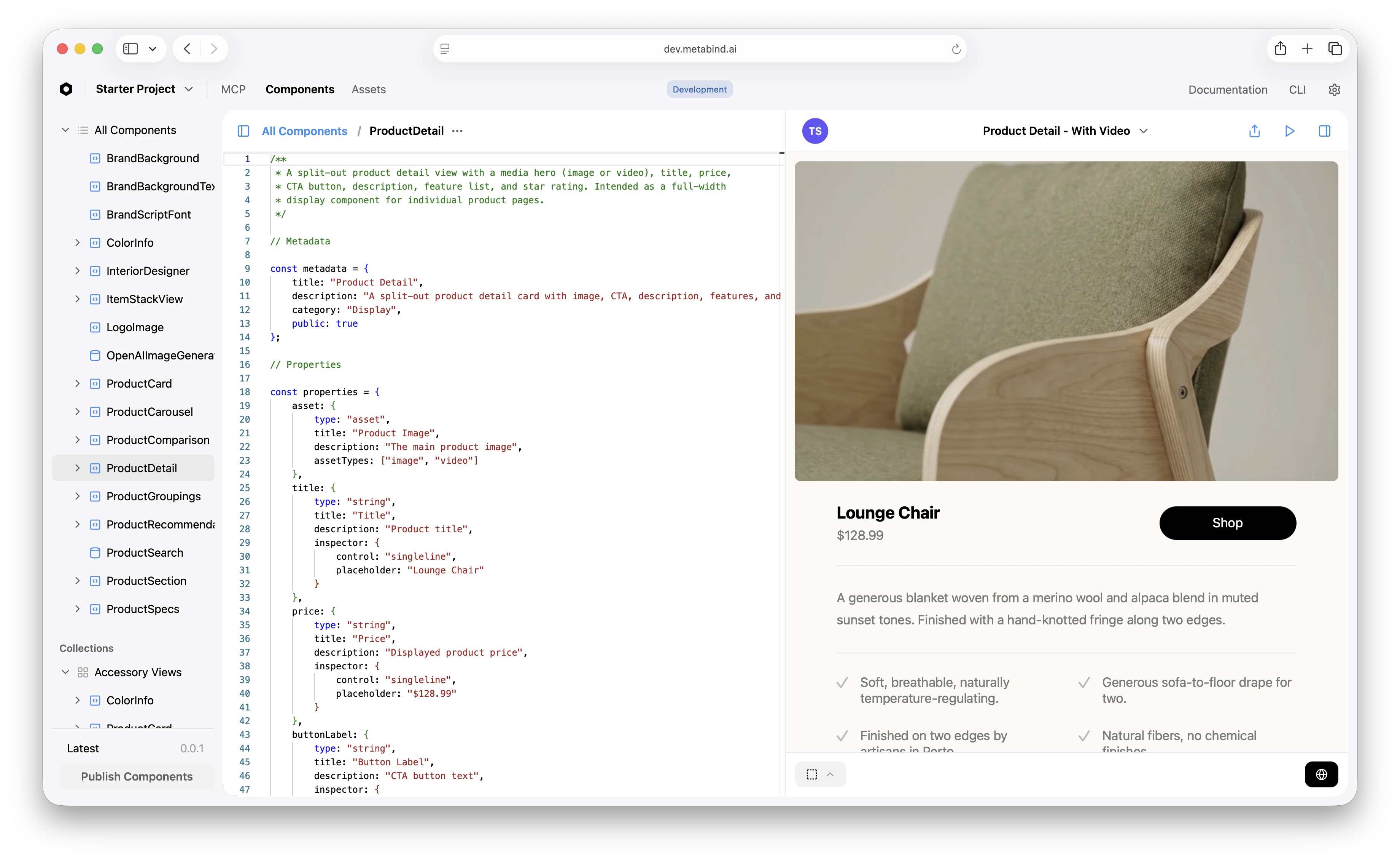 The editor has TypeScript-aware completion, syntax highlighting, and live error reporting. The preview re-renders on every save.
## Component file structure
A typical component file has these sections:
```ts theme={null}
// 1. Metadata — what the component is and where it appears in MCP App Studio
const metadata = {
title: "Product Detail",
description: "A split-out product detail card with image, CTA, and reviews",
category: "Display",
public: true
};
// 2. Property schema — the inputs the AI provides
const properties = {
title: { type: "string", title: "Title", inspector: { control: "singleline" } },
price: { type: "string", title: "Price" },
// ...
} satisfies ComponentProperties;
// 3. Sub-components — internal building blocks
const ProductTitle = (props: InferProps) => {
return Text(props.title).font("title2").fontWeight("bold");
};
// 4. Body — the entrypoint that renders the component
const body = (props: InferProps): Component => {
return VStack({ spacing: 16 }, [
ProductTitle(props),
// ...
]);
};
// 5. Previews — sample inputs for MCP App Studio's preview
const previews = [
Self({ title: "Lounge Chair", price: "$128.99" })
.previewName("Default")
];
// 6. Export
export default defineComponent({ metadata, properties, body, previews });
```
This shape is conventional, not enforced. The only required pieces are `properties`, `body`, and the default export — but following the convention helps anyone (including yourself in three months) read the file.
## The property system
A component's `properties` block declares two things at once: the tool's input schema (what the AI must provide) and the inspector configuration (how a non-developer configures the property in MCP App Studio).
| Property type | Use for |
| ------------- | ----------------------------------------------------------- |
| `string` | Text values |
| `number` | Numeric values, optionally with `min`/`max`/`step` |
| `boolean` | Toggles |
| `asset` | Images, videos, 3D models, PDFs (with `assetTypes`) |
| `array` | Lists of values, with `valueType` for each item |
| `group` | Nested object with its own properties |
| `component` | A reference to another component (with `allowedComponents`) |
The `inspector` config controls the editor UI:
```ts theme={null}
properties: {
starCount: {
type: "number",
title: "Star Count",
inspector: { control: "slider", step: 1 },
validation: { min: 0, max: 5 }
},
description: {
type: "string",
title: "Description",
inspector: { control: "multiline", numberOfLines: 4, placeholder: "..." }
},
features: {
type: "array",
title: "Features",
valueType: { type: "string" },
validation: { minItems: 0, maxItems: 20 }
}
}
```
For the full property reference, see the [BindJS Reference](/bindjs/introduction).
## Layout primitives
BindJS layout primitives follow a SwiftUI-inspired shape:
* `VStack({ spacing, alignment }, [children])` — vertical stack.
* `HStack({ spacing, alignment }, [children])` — horizontal stack.
* `ZStack([children])` — overlapping layers.
* `Spacer()` — flexible space.
* `ScrollView([children])` — scrollable container.
Modifier methods chain on any component:
```ts theme={null}
Text("Hello")
.font("title")
.fontWeight("bold")
.foregroundStyle(Color("black"))
.padding(16)
.background(Color("#F5F5F5"))
.cornerRadius(8);
```
For the full set of primitives and modifiers, see the [BindJS Reference](/bindjs/introduction).
## Sub-components and reuse
Break a complex `body` into named functions:
```ts theme={null}
const ProductImage = (props) => {
return Image({ ...props.asset.image, contentMode: "fill" })
.resizable()
.frame({ height: 420 })
.cornerRadius(8);
};
const HeaderRow = (props) => {
return HStack({ spacing: 24 }, [
ProductImage(props),
ProductTitle(props),
ShopButton(props)
]);
};
const body = (props) => {
return VStack({ spacing: 28 }, [
HeaderRow(props),
ProductDescription(props),
ReviewsSection(props)
]);
};
```
Sub-components are private to the file. To create a component shared across multiple Tools, author it as its own component in the **Components** tab — it'll show up in the sidebar and become available to allowlists.
## Custom button styles and modifiers
Button styles use `defineButtonStyle()`:
```ts theme={null}
const PrimaryButtonStyle = defineButtonStyle({
body: (config) => {
const [hovered, setIsHovered] = useState(false);
return config.label
.frame({ width: 180, height: 44 })
.background(hovered ? Color("black").opacity(0.8) : Color("black"))
.foregroundStyle(Color("white"))
.cornerRadius(23)
.scaleEffect(hovered ? 1.04 : 1.0)
.onHover((hover) => {
withAnimation(Spring(), () => setIsHovered(hover));
});
}
});
Button({ label: Text("Shop"), action: () => { /* ... */ } })
.buttonStyle(PrimaryButtonStyle());
```
Reusable button styles, modifiers, and shape definitions can be authored as separate components in the package and imported across many layouts.
## Iterating with the live preview
The preview re-renders on save. A few tips for fast iteration:
* **Add multiple `previews` entries** for different states — empty, populated, error. Switch between them in the preview pane.
* **Edit the preview file directly** to test edge cases without touching the test panel inputs.
* **Use the live device preview** (App Clip on iOS, Android preview, web link) to test how the component renders on actual hardware before publishing. See [Live device previews](/guides/building/live-previews).
## Common patterns
A few things you'll write often:
* **Conditional rendering:** Use `props.x ? Component(...) : Empty()`.
* **Asset fallbacks:** Test for video before image: `props.asset?.video ? Video(...) : Image(...)`.
* **Looping:** `props.items.map((item) => ItemView(item))` inside a stack.
* **Spacing:** Prefer `spacing` on stacks rather than `Spacer` between children.
* **Hover/tap state:** Use `useState` and `onHover`/`onTapGesture` modifiers.
## Related
Conceptual: shapes, packaging, versioning.
Preview on real iOS/Android devices.
Full BindJS API.
Restrict what the AI can compose.
The editor has TypeScript-aware completion, syntax highlighting, and live error reporting. The preview re-renders on every save.
## Component file structure
A typical component file has these sections:
```ts theme={null}
// 1. Metadata — what the component is and where it appears in MCP App Studio
const metadata = {
title: "Product Detail",
description: "A split-out product detail card with image, CTA, and reviews",
category: "Display",
public: true
};
// 2. Property schema — the inputs the AI provides
const properties = {
title: { type: "string", title: "Title", inspector: { control: "singleline" } },
price: { type: "string", title: "Price" },
// ...
} satisfies ComponentProperties;
// 3. Sub-components — internal building blocks
const ProductTitle = (props: InferProps) => {
return Text(props.title).font("title2").fontWeight("bold");
};
// 4. Body — the entrypoint that renders the component
const body = (props: InferProps): Component => {
return VStack({ spacing: 16 }, [
ProductTitle(props),
// ...
]);
};
// 5. Previews — sample inputs for MCP App Studio's preview
const previews = [
Self({ title: "Lounge Chair", price: "$128.99" })
.previewName("Default")
];
// 6. Export
export default defineComponent({ metadata, properties, body, previews });
```
This shape is conventional, not enforced. The only required pieces are `properties`, `body`, and the default export — but following the convention helps anyone (including yourself in three months) read the file.
## The property system
A component's `properties` block declares two things at once: the tool's input schema (what the AI must provide) and the inspector configuration (how a non-developer configures the property in MCP App Studio).
| Property type | Use for |
| ------------- | ----------------------------------------------------------- |
| `string` | Text values |
| `number` | Numeric values, optionally with `min`/`max`/`step` |
| `boolean` | Toggles |
| `asset` | Images, videos, 3D models, PDFs (with `assetTypes`) |
| `array` | Lists of values, with `valueType` for each item |
| `group` | Nested object with its own properties |
| `component` | A reference to another component (with `allowedComponents`) |
The `inspector` config controls the editor UI:
```ts theme={null}
properties: {
starCount: {
type: "number",
title: "Star Count",
inspector: { control: "slider", step: 1 },
validation: { min: 0, max: 5 }
},
description: {
type: "string",
title: "Description",
inspector: { control: "multiline", numberOfLines: 4, placeholder: "..." }
},
features: {
type: "array",
title: "Features",
valueType: { type: "string" },
validation: { minItems: 0, maxItems: 20 }
}
}
```
For the full property reference, see the [BindJS Reference](/bindjs/introduction).
## Layout primitives
BindJS layout primitives follow a SwiftUI-inspired shape:
* `VStack({ spacing, alignment }, [children])` — vertical stack.
* `HStack({ spacing, alignment }, [children])` — horizontal stack.
* `ZStack([children])` — overlapping layers.
* `Spacer()` — flexible space.
* `ScrollView([children])` — scrollable container.
Modifier methods chain on any component:
```ts theme={null}
Text("Hello")
.font("title")
.fontWeight("bold")
.foregroundStyle(Color("black"))
.padding(16)
.background(Color("#F5F5F5"))
.cornerRadius(8);
```
For the full set of primitives and modifiers, see the [BindJS Reference](/bindjs/introduction).
## Sub-components and reuse
Break a complex `body` into named functions:
```ts theme={null}
const ProductImage = (props) => {
return Image({ ...props.asset.image, contentMode: "fill" })
.resizable()
.frame({ height: 420 })
.cornerRadius(8);
};
const HeaderRow = (props) => {
return HStack({ spacing: 24 }, [
ProductImage(props),
ProductTitle(props),
ShopButton(props)
]);
};
const body = (props) => {
return VStack({ spacing: 28 }, [
HeaderRow(props),
ProductDescription(props),
ReviewsSection(props)
]);
};
```
Sub-components are private to the file. To create a component shared across multiple Tools, author it as its own component in the **Components** tab — it'll show up in the sidebar and become available to allowlists.
## Custom button styles and modifiers
Button styles use `defineButtonStyle()`:
```ts theme={null}
const PrimaryButtonStyle = defineButtonStyle({
body: (config) => {
const [hovered, setIsHovered] = useState(false);
return config.label
.frame({ width: 180, height: 44 })
.background(hovered ? Color("black").opacity(0.8) : Color("black"))
.foregroundStyle(Color("white"))
.cornerRadius(23)
.scaleEffect(hovered ? 1.04 : 1.0)
.onHover((hover) => {
withAnimation(Spring(), () => setIsHovered(hover));
});
}
});
Button({ label: Text("Shop"), action: () => { /* ... */ } })
.buttonStyle(PrimaryButtonStyle());
```
Reusable button styles, modifiers, and shape definitions can be authored as separate components in the package and imported across many layouts.
## Iterating with the live preview
The preview re-renders on save. A few tips for fast iteration:
* **Add multiple `previews` entries** for different states — empty, populated, error. Switch between them in the preview pane.
* **Edit the preview file directly** to test edge cases without touching the test panel inputs.
* **Use the live device preview** (App Clip on iOS, Android preview, web link) to test how the component renders on actual hardware before publishing. See [Live device previews](/guides/building/live-previews).
## Common patterns
A few things you'll write often:
* **Conditional rendering:** Use `props.x ? Component(...) : Empty()`.
* **Asset fallbacks:** Test for video before image: `props.asset?.video ? Video(...) : Image(...)`.
* **Looping:** `props.items.map((item) => ItemView(item))` inside a stack.
* **Spacing:** Prefer `spacing` on stacks rather than `Spacer` between children.
* **Hover/tap state:** Use `useState` and `onHover`/`onTapGesture` modifiers.
## Related
Conceptual: shapes, packaging, versioning.
Preview on real iOS/Android devices.
Full BindJS API.
Restrict what the AI can compose.