> ## Documentation Index
> Fetch the complete documentation index at: https://docs.metabind.ai/llms.txt
> Use this file to discover all available pages before exploring further.
# MCP App Studio
> The visual development surface where you build, configure, test, and publish an MCP App
**MCP App Studio** is the web application at [www.metabind.ai](https://www.metabind.ai) where developers and product teams build MCP Apps. It's the layer that sits on top of BindJS and the Metabind backend: a visual builder, a code editor, live device previews, a tool-test harness, an asset library, and the publishing surface — all wired into the same project.
Most MCP frameworks are SDKs that ship without a development surface; the developer sets up their own editor, hosting, debugging, and review workflow. MCP App Studio is what most MCP tooling doesn't have.
## What MCP App Studio gives you
| Capability | What it covers |
| ---------------------------- | ---------------------------------------------------------------------------------------------------------------------------------------------------------------------------------------------------------------------------------------- |
| **Visual component builder** | Inspector-driven configuration of components — single-line fields, multi-line text, sliders, color pickers, asset pickers — generated from the component's `inspector` schema. Non-developers can configure tools without touching code. |
| **Code editor** | Full BindJS code editor for component authoring. Live preview rendering alongside the code. Syntax highlighting, error reporting, and TypeScript-aware completion. |
| **Live device previews** | Generate a preview link for any component, content, or MCP App. iOS opens as an App Clip — instant, no install, real native SwiftUI on the device. Android opens in the Metabind preview app. Web opens in the browser. |
| **Tool test harness** | Run any Interactive Tool or Data Tool with synthetic input. The same code path that runs when an AI calls the tool — schema validation, package resolution, sandboxed execution — runs here. |
| **Asset library** | Drag-and-drop upload, semantic search, tagging, and inline preview for images, video, 3D, and PDFs. |
| **Server config** | Project metadata, AI instructions, server settings, OAuth, visibility (private vs. public), rate limiting. |
| **Connect tab** | Production and draft MCP server URLs, plus copy-paste config snippets for Claude Desktop, ChatGPT, and any custom MCP host. |
| **Publish workflow** | Draft and production endpoints, package versioning, modified-status tracking, instant rollback. |
| **Sample apps** | Clone a working MCP App in seconds — start from Oak & Ivory or any other sample. |
## Navigation
The top navigation has three tabs:
* **MCP** — Server, Connect, Gallery, UI Tools (Interactive Tools), Data Tools, Components.
* **Components** — the BindJS code editor surface for every component in the package.
* **Assets** — the media library.
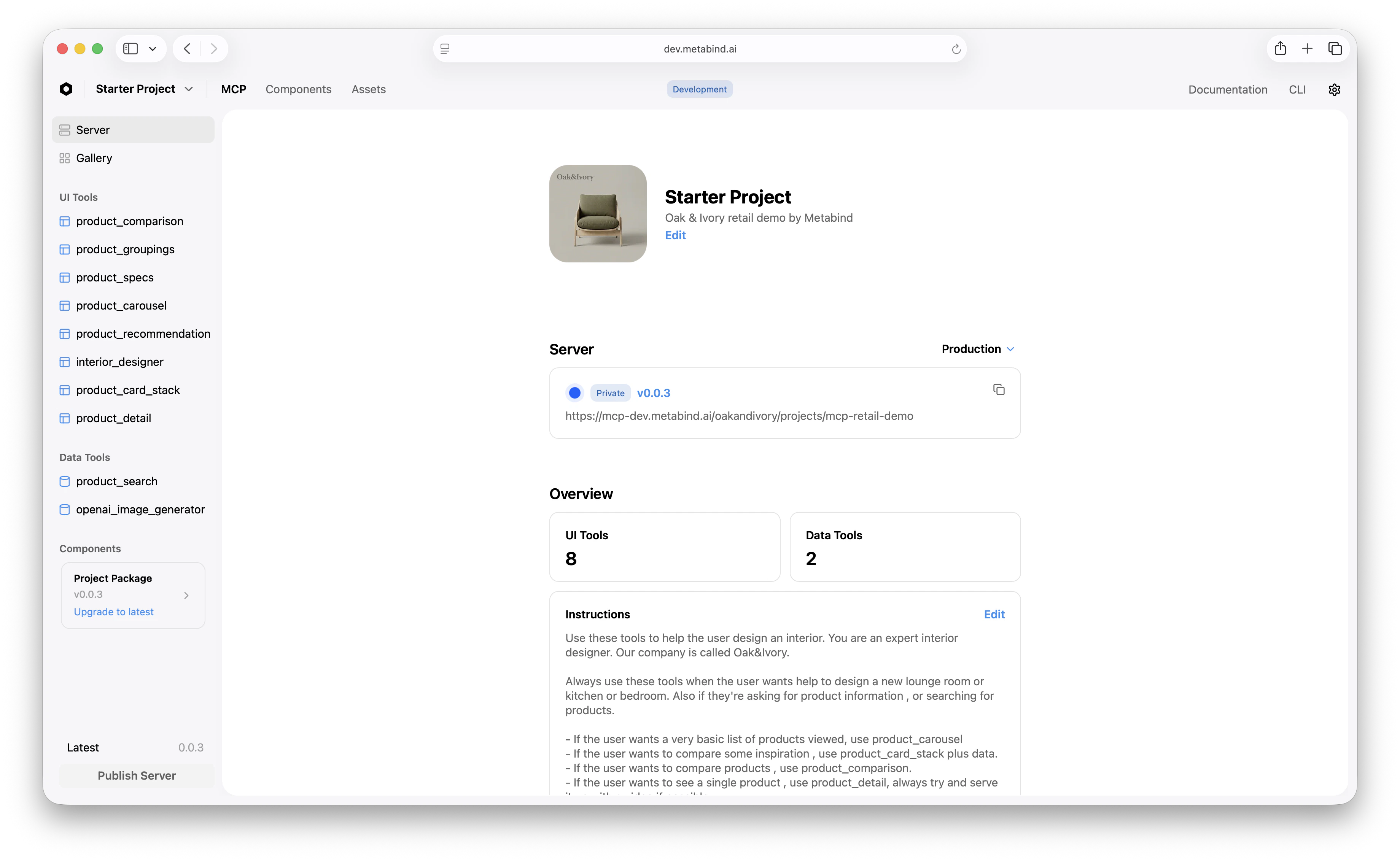
Inside an MCP project, the left sidebar groups everything by what it does:
| Section | Contains |
| -------------- | -------------------------------------------------- |
| **Server** | Project metadata, AI instructions, visibility |
| **Connect** | MCP server URLs and host config snippets |
| **Gallery** | Live preview gallery |
| **UI Tools** | Interactive Tools — one entry per Type |
| **Data Tools** | Data Tools — one entry per Type |
| **Components** | The BindJS source for everything that backs a Type |
Project-level settings (API keys, dependencies, team, billing) sit under a separate Settings menu.
 ## Roles and the multi-discipline model
MCP App Studio is designed so different team roles work in the surfaces meant for them:
* **Developers** spend most of their time in the Components tab — authoring BindJS, defining component properties, configuring data handlers.
* **Product managers** work in UI Tools and Data Tools — defining tool schemas, writing AI-facing descriptions, configuring allowed components.
* **Designers** work in Components (visual configuration via the inspector) and Assets — maintaining the design system and the media library directly, without filing engineering tickets.
* **Content editors** work in the Content surface, managing entries that Data Tools query as a headless CMS backend.
Each role can ship without blocking the others. A font change is a designer task in MCP App Studio, not a developer ticket.
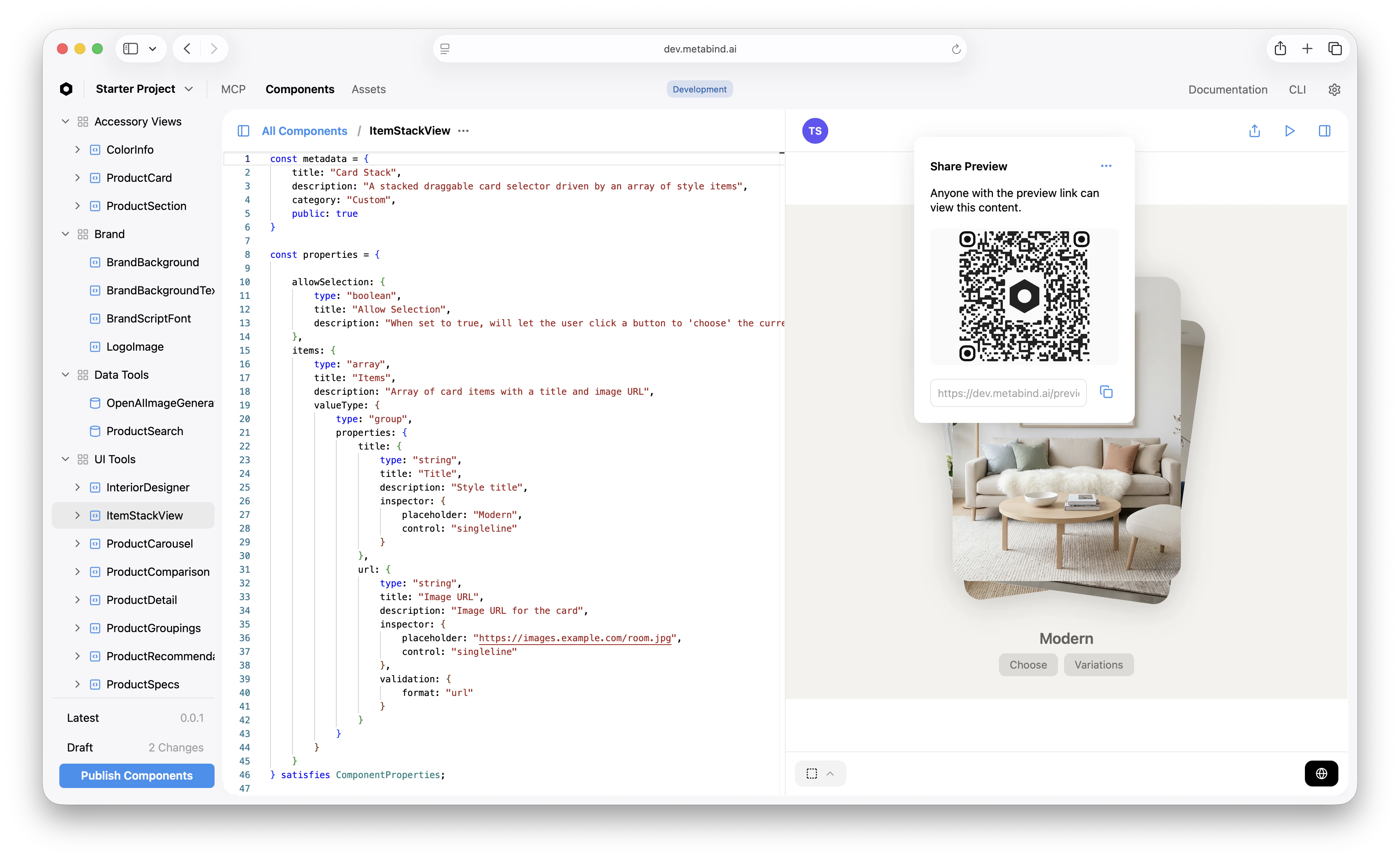
## Live device previews
MCP App Studio generates a preview URL for any component, Interactive Tool, or whole MCP App. The URL behaves differently per platform:
* **iOS:** Opens as an App Clip on iOS 14+ — no App Store install, real native SwiftUI rendering on the device. The app clip is signed and bundled by Metabind; it loads your project's package and renders the requested component.
* **Android:** Opens in the Metabind Preview app, which the developer installs once. The app loads the requested component's BindJS bundle and renders as native Compose.
* **Web:** Opens in the browser, rendered by `@bindjs/renderer` (React).
Preview connects to the project's draft endpoint by default, so you can iterate before publishing without affecting production.
## Roles and the multi-discipline model
MCP App Studio is designed so different team roles work in the surfaces meant for them:
* **Developers** spend most of their time in the Components tab — authoring BindJS, defining component properties, configuring data handlers.
* **Product managers** work in UI Tools and Data Tools — defining tool schemas, writing AI-facing descriptions, configuring allowed components.
* **Designers** work in Components (visual configuration via the inspector) and Assets — maintaining the design system and the media library directly, without filing engineering tickets.
* **Content editors** work in the Content surface, managing entries that Data Tools query as a headless CMS backend.
Each role can ship without blocking the others. A font change is a designer task in MCP App Studio, not a developer ticket.
## Live device previews
MCP App Studio generates a preview URL for any component, Interactive Tool, or whole MCP App. The URL behaves differently per platform:
* **iOS:** Opens as an App Clip on iOS 14+ — no App Store install, real native SwiftUI rendering on the device. The app clip is signed and bundled by Metabind; it loads your project's package and renders the requested component.
* **Android:** Opens in the Metabind Preview app, which the developer installs once. The app loads the requested component's BindJS bundle and renders as native Compose.
* **Web:** Opens in the browser, rendered by `@bindjs/renderer` (React).
Preview connects to the project's draft endpoint by default, so you can iterate before publishing without affecting production.
 ## What MCP App Studio is built on
MCP App Studio is a React application that talks to the Metabind backend. It's part of the platform — not a separate product — but conceptually it sits at the same layer as the BindJS authoring layer: developer-trust surface, used every day, where the developer's relationship with Metabind happens.
## What to read next
The end-to-end walkthrough using MCP App Studio.
How-tos for the surfaces MCP App Studio exposes.
How-to: use the MCP App Studio test harness.
How-to: preview on a real device before publishing.
## What MCP App Studio is built on
MCP App Studio is a React application that talks to the Metabind backend. It's part of the platform — not a separate product — but conceptually it sits at the same layer as the BindJS authoring layer: developer-trust surface, used every day, where the developer's relationship with Metabind happens.
## What to read next
The end-to-end walkthrough using MCP App Studio.
How-tos for the surfaces MCP App Studio exposes.
How-to: use the MCP App Studio test harness.
How-to: preview on a real device before publishing.