> ## Documentation Index
> Fetch the complete documentation index at: https://docs.metabind.ai/llms.txt
> Use this file to discover all available pages before exploring further.
# Tools and Types
> Types are the registration unit that becomes an MCP tool — Interactive or Data
A **Type** is the unit Metabind registers with the MCP server as a callable tool. Each published Type becomes a named MCP tool: the Type's slug is the tool name, the Type's schema is the tool's input schema, and the Type's description is the tool's description.
Types come in two flavors based on the component they're backed by — Interactive Tools (rendered UI) and Data Tools (structured JSON). To expose Metabind-managed content (a headless CMS project) as a tool, wrap it in a Data Tool that calls the [Metabind Content API](/content/querying/overview).
 ## Interactive Tools
**Backed by a layout component.** The AI generates schema-conforming JSON in a single call; the platform validates against the schema, compiles the JSON to BindJS, and returns a rendered UI bundle. Only components on the Type's allowlist can appear in the result.
Interactive Tools are how the AI returns rendered components instead of text — product cards, data tables, charts, comparison views, photo galleries, forms, animated layouts. The expressive range is the same as the rest of your app.
## Data Tools
**Backed by a data component.** The AI calls the tool with structured input; the platform executes the component's `handler()` function inside a V8 sandbox to fetch data from external APIs, then returns structured JSON.
Data Tools are how the AI gets the data it needs to answer a question. Common pattern: the AI calls a Data Tool to fetch something, then chains into an Interactive Tool to render the result.
Handlers run with secrets (API keys, OAuth tokens) injected via `env.secrets` rather than embedded in the component code. Outbound HTTP is restricted to allowed domains. Execution time and memory are capped (60 seconds, 128 MB).
### Content as a Data Tool (the headless CMS pattern)
When the data the AI needs is content you manage in Metabind itself — a product catalog, a knowledge base, a library of documents — wrap that content in a Data Tool that calls the [Metabind Content API](/content/querying/overview). This is how Oak & Ivory's `product_search` works: the catalog and images live in a Metabind content project; the Data Tool's `handler()` queries the project and returns ranked products to the AI.
```ts theme={null}
// Excerpt from product_search.bindjs
export default defineDataSource({
metadata: { title: "Product Search" },
properties: { searchTerm: { type: "string" } },
handler: async (props, env) => {
const res = await fetch(
`${env.apiBaseURL}/api/v1/orgs/${env.organizationId}/projects/${env.projectId}/content?q=${props.searchTerm}`
);
return rankAndReturn(await res.json());
}
});
```
Same shape as a Data Tool that wraps any other API — Metabind's Content API just happens to be a great fit when an editorial team also needs to manage the underlying records in MCP App Studio.
## Type properties resolve in three tiers
When the MCP server registers a Type as a tool, it resolves tool properties (`title`, `annotations.*`, `execution`) in this order:
```
config.{property} → component code declaration → platform default
```
So a Type editor can override defaults that the component author set, and the component author can override the platform defaults — without anyone touching the others' surface.
| Tool property | Source |
| ---------------------------------- | ------------------------------------------------------------------------------------------------------------------ |
| `name` | Type slug (auto-generated, immutable after first publish) |
| `title` | Type config → component metadata title → Type name |
| `description` | Type description (LLM-optimized) |
| `inputSchema` | Type schema (auto-generated from properties + allowed children for layouts; from `properties` for data components) |
| `outputSchema` *(Data Tools only)* | Data component `output` |
| `annotations` | Type config → component annotations → MCP spec defaults |
## Types are versioned via packages
A Type references a specific package version. Editing a published Type puts it in `modified` status — the production endpoint continues to serve the last published version while the draft endpoint shows the working copy. Publishing the project promotes the modified Type's package version to production.
This means Types are immutable in production until you choose to update them. See [Components and Packages](/guides/concepts/components) for the package model.
## Decision: Interactive Tool or Data Tool?
| If the AI's job is to… | Use |
| ---------------------------------------------- | --------------------------------------------------------------------------------------------------------------------------- |
| Return rendered UI | Interactive Tool |
| Return structured JSON the AI will reason over | Data Tool |
| Fetch then render | Data Tool → Interactive Tool, chained |
| Search or retrieve content | Use the auto-registered `search_assets` capability, or a Data Tool that wraps the [Content API](/content/querying/overview) |
When in doubt: if the user should *see* something, use an Interactive Tool. If the AI needs to *think with* something, use a Data Tool.
## Where Types live in MCP App Studio
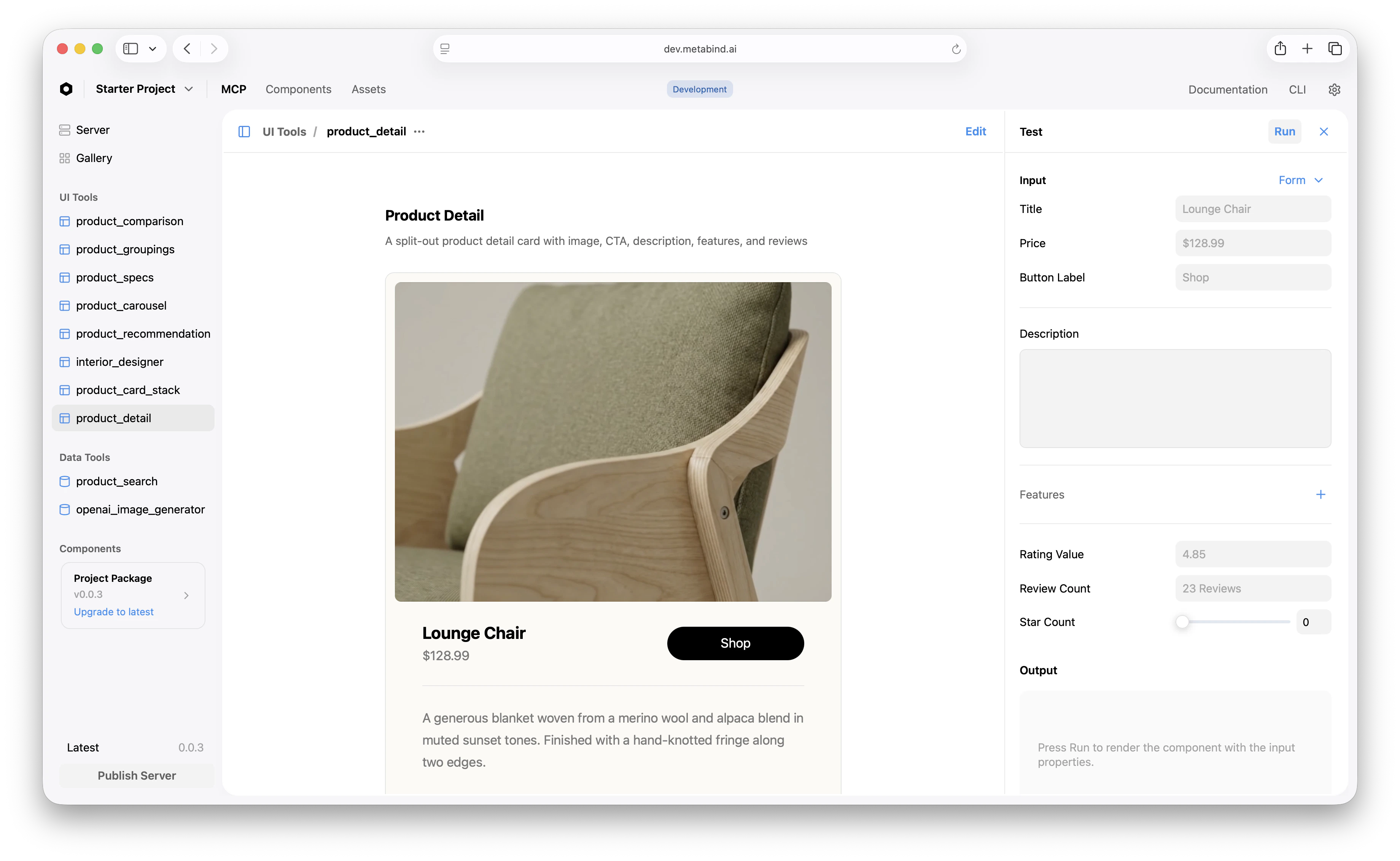
Types appear in the project sidebar under **UI Tools** (Interactive Tools) and **Data Tools**. The list shows every Type's status (Draft, Published, Modified) and the component that backs it.
## Interactive Tools
**Backed by a layout component.** The AI generates schema-conforming JSON in a single call; the platform validates against the schema, compiles the JSON to BindJS, and returns a rendered UI bundle. Only components on the Type's allowlist can appear in the result.
Interactive Tools are how the AI returns rendered components instead of text — product cards, data tables, charts, comparison views, photo galleries, forms, animated layouts. The expressive range is the same as the rest of your app.
## Data Tools
**Backed by a data component.** The AI calls the tool with structured input; the platform executes the component's `handler()` function inside a V8 sandbox to fetch data from external APIs, then returns structured JSON.
Data Tools are how the AI gets the data it needs to answer a question. Common pattern: the AI calls a Data Tool to fetch something, then chains into an Interactive Tool to render the result.
Handlers run with secrets (API keys, OAuth tokens) injected via `env.secrets` rather than embedded in the component code. Outbound HTTP is restricted to allowed domains. Execution time and memory are capped (60 seconds, 128 MB).
### Content as a Data Tool (the headless CMS pattern)
When the data the AI needs is content you manage in Metabind itself — a product catalog, a knowledge base, a library of documents — wrap that content in a Data Tool that calls the [Metabind Content API](/content/querying/overview). This is how Oak & Ivory's `product_search` works: the catalog and images live in a Metabind content project; the Data Tool's `handler()` queries the project and returns ranked products to the AI.
```ts theme={null}
// Excerpt from product_search.bindjs
export default defineDataSource({
metadata: { title: "Product Search" },
properties: { searchTerm: { type: "string" } },
handler: async (props, env) => {
const res = await fetch(
`${env.apiBaseURL}/api/v1/orgs/${env.organizationId}/projects/${env.projectId}/content?q=${props.searchTerm}`
);
return rankAndReturn(await res.json());
}
});
```
Same shape as a Data Tool that wraps any other API — Metabind's Content API just happens to be a great fit when an editorial team also needs to manage the underlying records in MCP App Studio.
## Type properties resolve in three tiers
When the MCP server registers a Type as a tool, it resolves tool properties (`title`, `annotations.*`, `execution`) in this order:
```
config.{property} → component code declaration → platform default
```
So a Type editor can override defaults that the component author set, and the component author can override the platform defaults — without anyone touching the others' surface.
| Tool property | Source |
| ---------------------------------- | ------------------------------------------------------------------------------------------------------------------ |
| `name` | Type slug (auto-generated, immutable after first publish) |
| `title` | Type config → component metadata title → Type name |
| `description` | Type description (LLM-optimized) |
| `inputSchema` | Type schema (auto-generated from properties + allowed children for layouts; from `properties` for data components) |
| `outputSchema` *(Data Tools only)* | Data component `output` |
| `annotations` | Type config → component annotations → MCP spec defaults |
## Types are versioned via packages
A Type references a specific package version. Editing a published Type puts it in `modified` status — the production endpoint continues to serve the last published version while the draft endpoint shows the working copy. Publishing the project promotes the modified Type's package version to production.
This means Types are immutable in production until you choose to update them. See [Components and Packages](/guides/concepts/components) for the package model.
## Decision: Interactive Tool or Data Tool?
| If the AI's job is to… | Use |
| ---------------------------------------------- | --------------------------------------------------------------------------------------------------------------------------- |
| Return rendered UI | Interactive Tool |
| Return structured JSON the AI will reason over | Data Tool |
| Fetch then render | Data Tool → Interactive Tool, chained |
| Search or retrieve content | Use the auto-registered `search_assets` capability, or a Data Tool that wraps the [Content API](/content/querying/overview) |
When in doubt: if the user should *see* something, use an Interactive Tool. If the AI needs to *think with* something, use a Data Tool.
## Where Types live in MCP App Studio
Types appear in the project sidebar under **UI Tools** (Interactive Tools) and **Data Tools**. The list shows every Type's status (Draft, Published, Modified) and the component that backs it.
 ## What to read next
Each Type is backed by a component inside a versioned package.
How schema validation and component allowlists protect every render.
How-to: define an Interactive Tool from scratch.
How-to: wrap an API as a Data Tool.
## What to read next
Each Type is backed by a component inside a versioned package.
How schema validation and component allowlists protect every render.
How-to: define an Interactive Tool from scratch.
How-to: wrap an API as a Data Tool.