> ## Documentation Index
> Fetch the complete documentation index at: https://docs.metabind.ai/llms.txt
> Use this file to discover all available pages before exploring further.
# Your first MCP App
> Publish a working MCP App to Claude Desktop in five minutes using the Oak & Ivory retail sample
Metabind is The Agentic Layer for your App — your UI and APIs become a governed agent that renders as native SwiftUI, Jetpack Compose, and React from a single BindJS definition, validated on every render. This guide walks you through building and publishing your first MCP App end-to-end.
You won't write any code in this tutorial. You'll start from **Oak & Ivory**, a complete retail sample, hook it up to Claude Desktop, and watch native product cards render inline in a conversation. The same MCP App also works in ChatGPT and any other MCP-compatible host.
## What you'll build
The **Oak & Ivory** sample is a retail MCP App for an interior-design brand. It includes:
* **8 Interactive Tools** that render UI: `product_detail`, `product_carousel`, `product_groupings`, `product_comparison`, `product_recommendation`, `product_specs`, `product_card_stack`, and `interior_designer`.
* **2 Data Tools** that fetch data: `product_search` (semantic search over the Oak & Ivory catalog) and `openai_image_generator`.
* **Project instructions** that tell the AI how and when to use each tool — for example, *"If the user wants to see a single product, use `product_detail`. If the user wants to compare products, use `product_comparison`."*
When you ask Claude something like *"Show me a coffee table from Oak & Ivory"*, the AI calls `product_search` to fetch matching items, then calls `product_detail` to render one inline. The renderer compiles the BindJS component, validates the AI's response against the tool's schema, and displays a native-looking product card in the chat.
## Prerequisites
* A Metabind account. [Create one](/guides/getting-started/create-account) if you haven't yet.
* [Claude Desktop](https://claude.ai/download) installed locally.
You don't need to install any SDK or write any code for this tutorial.
## Step 1: Create a project from the Oak & Ivory sample
Open [www.metabind.ai](https://www.metabind.ai) and sign in.
From the project picker, choose **New project**. The sample picker offers a blank starter and **Oak & Ivory**. Pick Oak & Ivory.
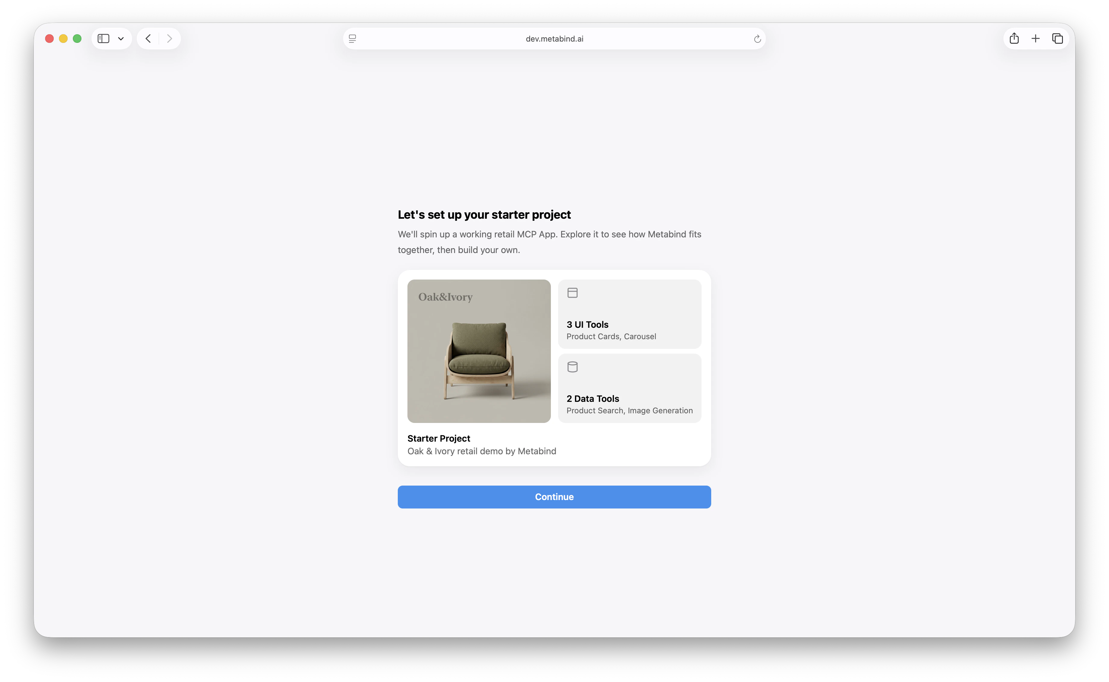 The project loads with all eight Interactive Tools, both Data Tools, the component package, and the AI instructions already configured.
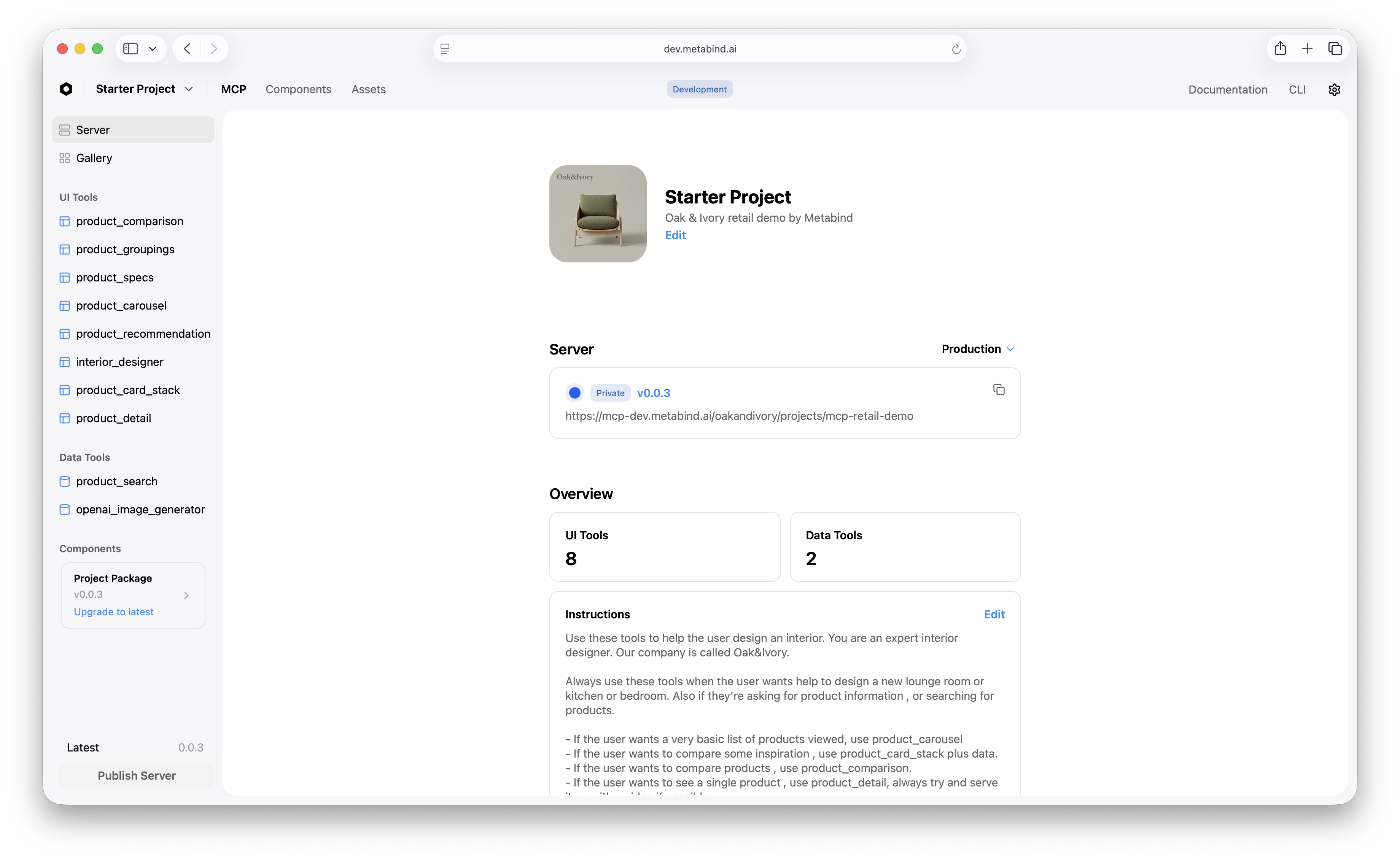 The left sidebar groups everything by what it does:
* **Server**, **Connect**, **Gallery** — project-level settings, MCP server URLs, and the asset gallery.
* **UI Tools** — Interactive Tools, the ones that render UI when the AI calls them.
* **Data Tools** — handlers that fetch data, run in V8 sandboxes with secrets injected at runtime.
* **Components** — the BindJS source for everything the tools render.
The main pane shows the project's name, description, website URL, and the **Instructions** block. Instructions are sent to the AI as guidance for how to use the tools — they're how a project tells the model *"call `product_detail` when the user wants to see a single product, and always serve it up with a video if there is one."*
## Step 2: Test a tool inline
Before connecting Claude Desktop, run a tool from inside MCP App Studio to see what the AI will see.
In the **UI Tools** sidebar, click `product_detail`. The center pane shows the rendered preview; the right pane is the test panel.
Enter values for `Title`, `Price`, `Button Label`, `Description`, and the other inputs. The defaults from the preview already produce a reasonable lounge chair.
Click **Run**. The platform validates your input against the tool's schema, compiles the BindJS to a renderable bundle, and displays the result.
The left sidebar groups everything by what it does:
* **Server**, **Connect**, **Gallery** — project-level settings, MCP server URLs, and the asset gallery.
* **UI Tools** — Interactive Tools, the ones that render UI when the AI calls them.
* **Data Tools** — handlers that fetch data, run in V8 sandboxes with secrets injected at runtime.
* **Components** — the BindJS source for everything the tools render.
The main pane shows the project's name, description, website URL, and the **Instructions** block. Instructions are sent to the AI as guidance for how to use the tools — they're how a project tells the model *"call `product_detail` when the user wants to see a single product, and always serve it up with a video if there is one."*
## Step 2: Test a tool inline
Before connecting Claude Desktop, run a tool from inside MCP App Studio to see what the AI will see.
In the **UI Tools** sidebar, click `product_detail`. The center pane shows the rendered preview; the right pane is the test panel.
Enter values for `Title`, `Price`, `Button Label`, `Description`, and the other inputs. The defaults from the preview already produce a reasonable lounge chair.
Click **Run**. The platform validates your input against the tool's schema, compiles the BindJS to a renderable bundle, and displays the result.
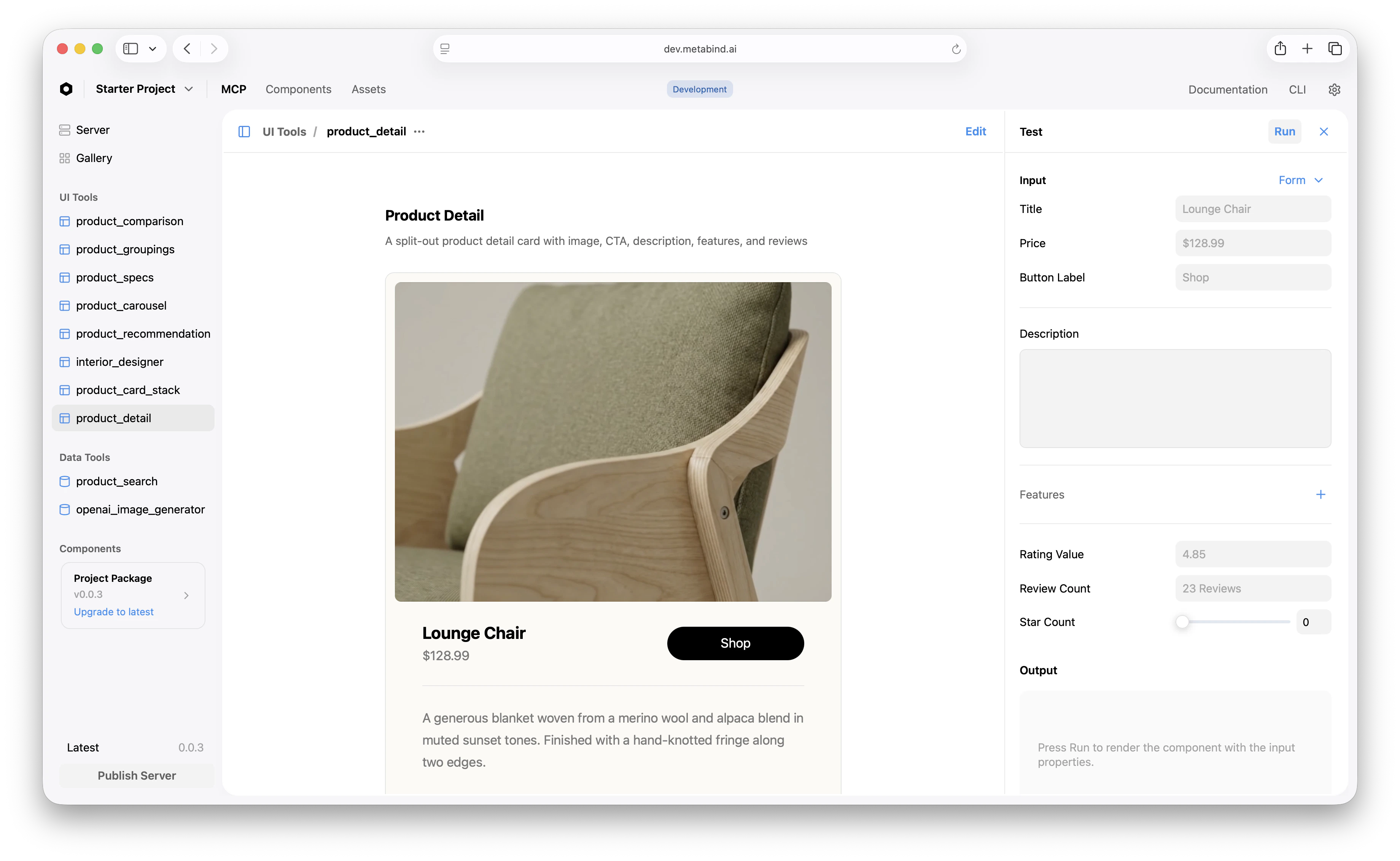 This is the same code path that runs when an AI calls the tool from Claude Desktop. The schema-validated rendering is the production safety net — the AI cannot inject components you didn't approve, and a malformed input never reaches the renderer.
## Step 3: Inspect the BindJS source (optional)
Skip this step if you want to keep moving. It's worth a glance, though, because every Interactive Tool in Oak & Ivory is a BindJS component you can read and edit directly in MCP App Studio.
Click **Components** in the top navigation. The sidebar lists every component the project ships, including `ProductDetail`, `ProductCarousel`, `ProductSearch`, and shared primitives like `BrandBackground` and `ColorInfo`.
Click `ProductDetail`. The code editor shows the BindJS source; the right pane shows live previews driven by the `previews` array at the bottom of the file.
This is the same code path that runs when an AI calls the tool from Claude Desktop. The schema-validated rendering is the production safety net — the AI cannot inject components you didn't approve, and a malformed input never reaches the renderer.
## Step 3: Inspect the BindJS source (optional)
Skip this step if you want to keep moving. It's worth a glance, though, because every Interactive Tool in Oak & Ivory is a BindJS component you can read and edit directly in MCP App Studio.
Click **Components** in the top navigation. The sidebar lists every component the project ships, including `ProductDetail`, `ProductCarousel`, `ProductSearch`, and shared primitives like `BrandBackground` and `ColorInfo`.
Click `ProductDetail`. The code editor shows the BindJS source; the right pane shows live previews driven by the `previews` array at the bottom of the file.
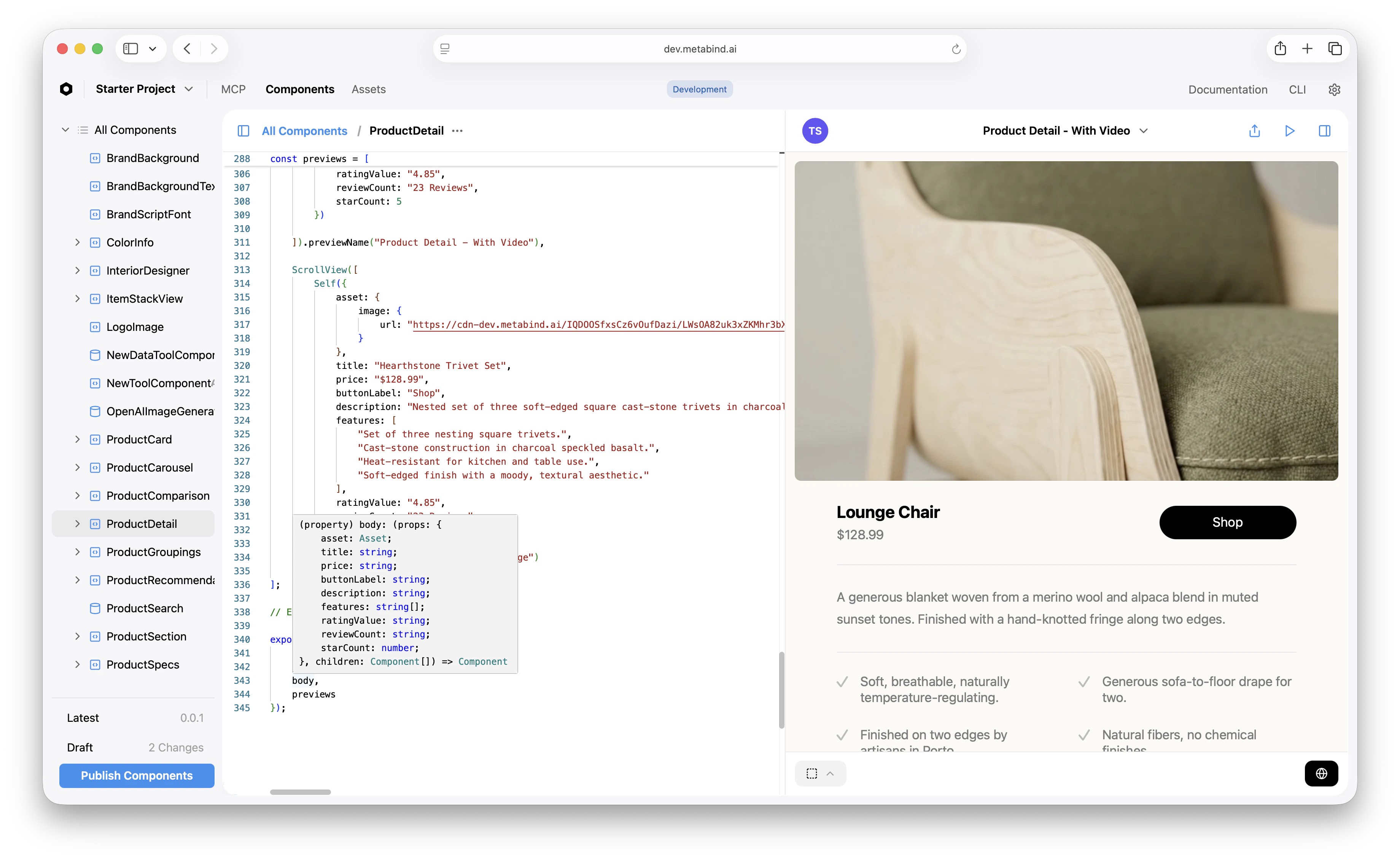 BindJS is a declarative, SwiftUI-inspired component language. A single component definition compiles to React in MCP hosts and to native SwiftUI or Jetpack Compose when embedded via the Assistant SDK, so what you see in this preview is what your customers will see in production.
## Step 4: Connect to Claude Desktop using the draft URL
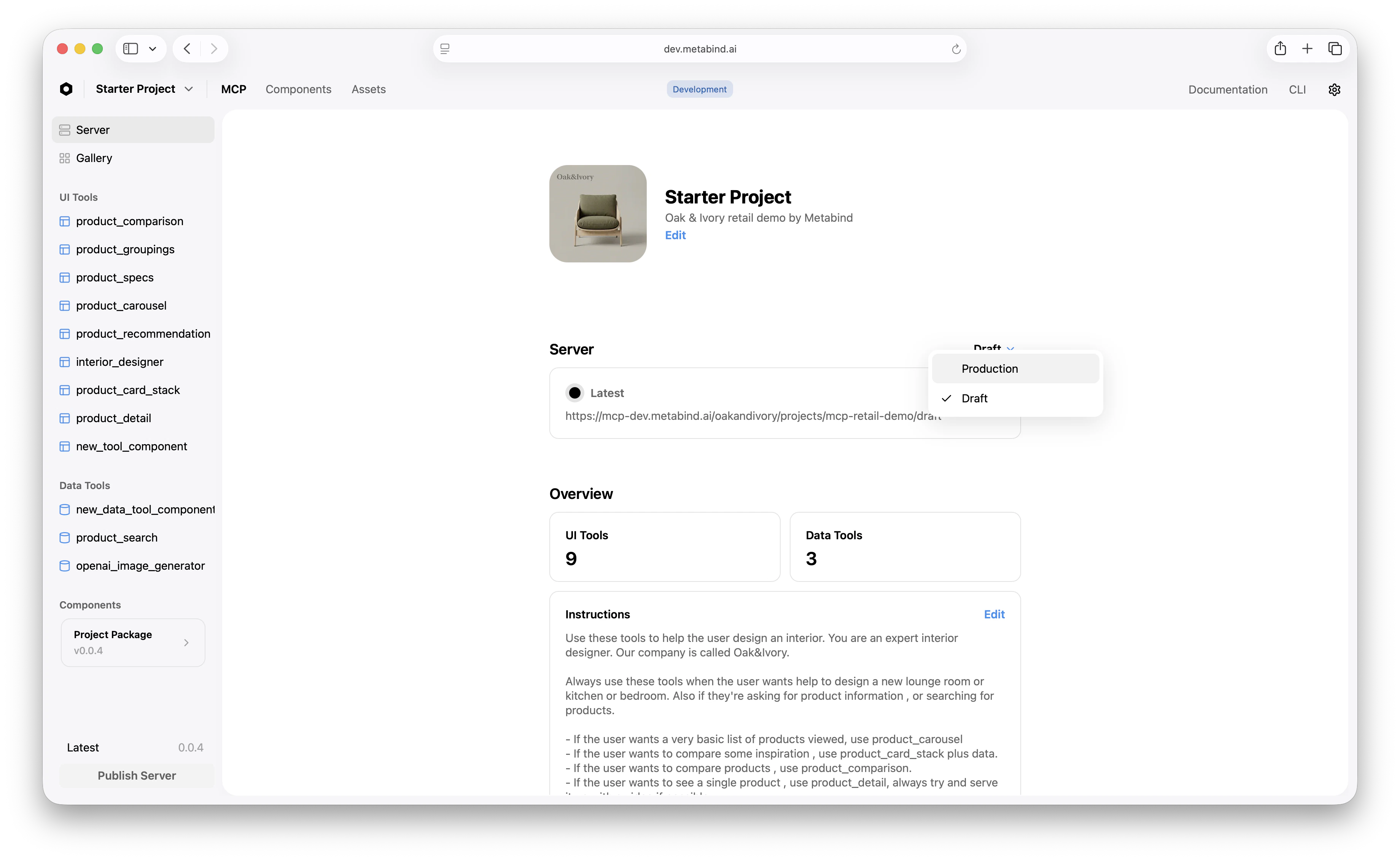
You don't need to publish to test. Every project has a **draft endpoint** that exposes every tool — published, modified, and unpublished — for development. Point Claude Desktop at the draft URL first; you'll publish to production once it's working.
On the **Server** tab in MCP App Studio, switch the endpoint dropdown to **Draft** and copy the URL.
BindJS is a declarative, SwiftUI-inspired component language. A single component definition compiles to React in MCP hosts and to native SwiftUI or Jetpack Compose when embedded via the Assistant SDK, so what you see in this preview is what your customers will see in production.
## Step 4: Connect to Claude Desktop using the draft URL
You don't need to publish to test. Every project has a **draft endpoint** that exposes every tool — published, modified, and unpublished — for development. Point Claude Desktop at the draft URL first; you'll publish to production once it's working.
On the **Server** tab in MCP App Studio, switch the endpoint dropdown to **Draft** and copy the URL.
 Open **Claude → Settings → Connectors → Add custom connector**, paste the draft URL, and click **Add**.
The new connector appears with a **Connect** button. Click it. Claude Desktop opens a Metabind authorization page — sign in if you aren't already, then click **Authorize**.
The popup closes and the connector flips to **Connected**. Your project's tools are now available in Claude Desktop conversations.
If the Authorize click doesn't open a popup, check your browser's pop-up blocker. If the popup opens but you see "Not authorized," confirm you're signed in to Metabind with an account that's a member of this organization.
## Step 5: Try it
In Claude Desktop, start a new conversation and try one of these:
* *"Show me a coffee table from Oak & Ivory."*
* *"I'm decorating a small living room — recommend three accent pieces."*
* *"Compare the Heritage Walnut and Ivory Oak coffee tables."*
Claude will call `product_search` to find matching items, then call an Interactive Tool — usually `product_detail`, `product_carousel`, or `product_comparison` — to render the result. The rendered card appears inline in the conversation, not as a JSON dump.
Behind the scenes, every render goes through schema validation against the tool's input schema, and only components from the project's published package can appear. That's the governance baseline: the AI cannot inject components you didn't approve, on any surface.
## Step 6: Publish to production
When the draft is working the way you want, publish:
The button is at the bottom-left of the project sidebar. The pending-changes counter resets to zero.
Add a second custom connector in Claude → Settings → Connectors using the **Production** URL from the Server tab, and authorize it. The production URL is what you give to anyone you want to share the MCP App with — they paste it, click **Connect**, and authorize with their own Metabind login.
The draft endpoint stays available for ongoing development. Editing a published tool puts it in `modified` status — the production endpoint continues to serve the last published version while the draft endpoint shows the working copy. You can iterate without breaking what's already live.
## What you've built
In a few minutes you have:
* A live MCP App on `mcp.metabind.ai` that any MCP host can connect to.
* Eight Interactive Tools that render schema-validated native UI rather than text returns.
* Two Data Tools that proxy your APIs through V8-sandboxed handlers with runtime-injected secrets.
* A production endpoint and a draft endpoint, with publish-and-rollback already wired in.
The same MCP App definition is also ready to embed inside your own iOS, Android, or web app as a native AI assistant via the Assistant SDK — covered in a separate guide.
## What to read next
Edit the Oak & Ivory components or write your own with BindJS.
Wrap one of your own REST or GraphQL endpoints as an MCP tool.
Use the same MCP App in ChatGPT and any other MCP-compatible host.
Ship the same MCP App as a native AI assistant in iOS, Android, or web.
Open **Claude → Settings → Connectors → Add custom connector**, paste the draft URL, and click **Add**.
The new connector appears with a **Connect** button. Click it. Claude Desktop opens a Metabind authorization page — sign in if you aren't already, then click **Authorize**.
The popup closes and the connector flips to **Connected**. Your project's tools are now available in Claude Desktop conversations.
If the Authorize click doesn't open a popup, check your browser's pop-up blocker. If the popup opens but you see "Not authorized," confirm you're signed in to Metabind with an account that's a member of this organization.
## Step 5: Try it
In Claude Desktop, start a new conversation and try one of these:
* *"Show me a coffee table from Oak & Ivory."*
* *"I'm decorating a small living room — recommend three accent pieces."*
* *"Compare the Heritage Walnut and Ivory Oak coffee tables."*
Claude will call `product_search` to find matching items, then call an Interactive Tool — usually `product_detail`, `product_carousel`, or `product_comparison` — to render the result. The rendered card appears inline in the conversation, not as a JSON dump.
Behind the scenes, every render goes through schema validation against the tool's input schema, and only components from the project's published package can appear. That's the governance baseline: the AI cannot inject components you didn't approve, on any surface.
## Step 6: Publish to production
When the draft is working the way you want, publish:
The button is at the bottom-left of the project sidebar. The pending-changes counter resets to zero.
Add a second custom connector in Claude → Settings → Connectors using the **Production** URL from the Server tab, and authorize it. The production URL is what you give to anyone you want to share the MCP App with — they paste it, click **Connect**, and authorize with their own Metabind login.
The draft endpoint stays available for ongoing development. Editing a published tool puts it in `modified` status — the production endpoint continues to serve the last published version while the draft endpoint shows the working copy. You can iterate without breaking what's already live.
## What you've built
In a few minutes you have:
* A live MCP App on `mcp.metabind.ai` that any MCP host can connect to.
* Eight Interactive Tools that render schema-validated native UI rather than text returns.
* Two Data Tools that proxy your APIs through V8-sandboxed handlers with runtime-injected secrets.
* A production endpoint and a draft endpoint, with publish-and-rollback already wired in.
The same MCP App definition is also ready to embed inside your own iOS, Android, or web app as a native AI assistant via the Assistant SDK — covered in a separate guide.
## What to read next
Edit the Oak & Ivory components or write your own with BindJS.
Wrap one of your own REST or GraphQL endpoints as an MCP tool.
Use the same MCP App in ChatGPT and any other MCP-compatible host.
Ship the same MCP App as a native AI assistant in iOS, Android, or web.