> ## Documentation Index
> Fetch the complete documentation index at: https://docs.metabind.ai/llms.txt
> Use this file to discover all available pages before exploring further.
# Oak & Ivory: a sample retail MCP App
> A complete retail MCP App example covering Interactive Tools, Data Tools, and a connected shopping flow
Oak & Ivory is the sample retail MCP App that ships with Metabind. It demonstrates the patterns most product MCP Apps will share — a Data Tool that searches a catalog, an Interactive Tool that renders product details, and a layout component reused across multiple Tools. This page walks through what's in it and why each piece exists.
## What Oak & Ivory does
Oak & Ivory exposes two MCP tools to a connected AI host:
| Tool | Type | Purpose |
| ---------------- | ---------------- | --------------------------------------------------------------------------------------- |
| `product_search` | Data Tool | Searches the catalog by keyword and returns structured product data |
| `product_detail` | Interactive Tool | Renders a single product as a native card, with image, title, price, and call-to-action |
Together they support flows like:
 The AI decides when to chain — `product_search` returns JSON, `product_detail` returns native UI.
## Get the sample
Two ways:
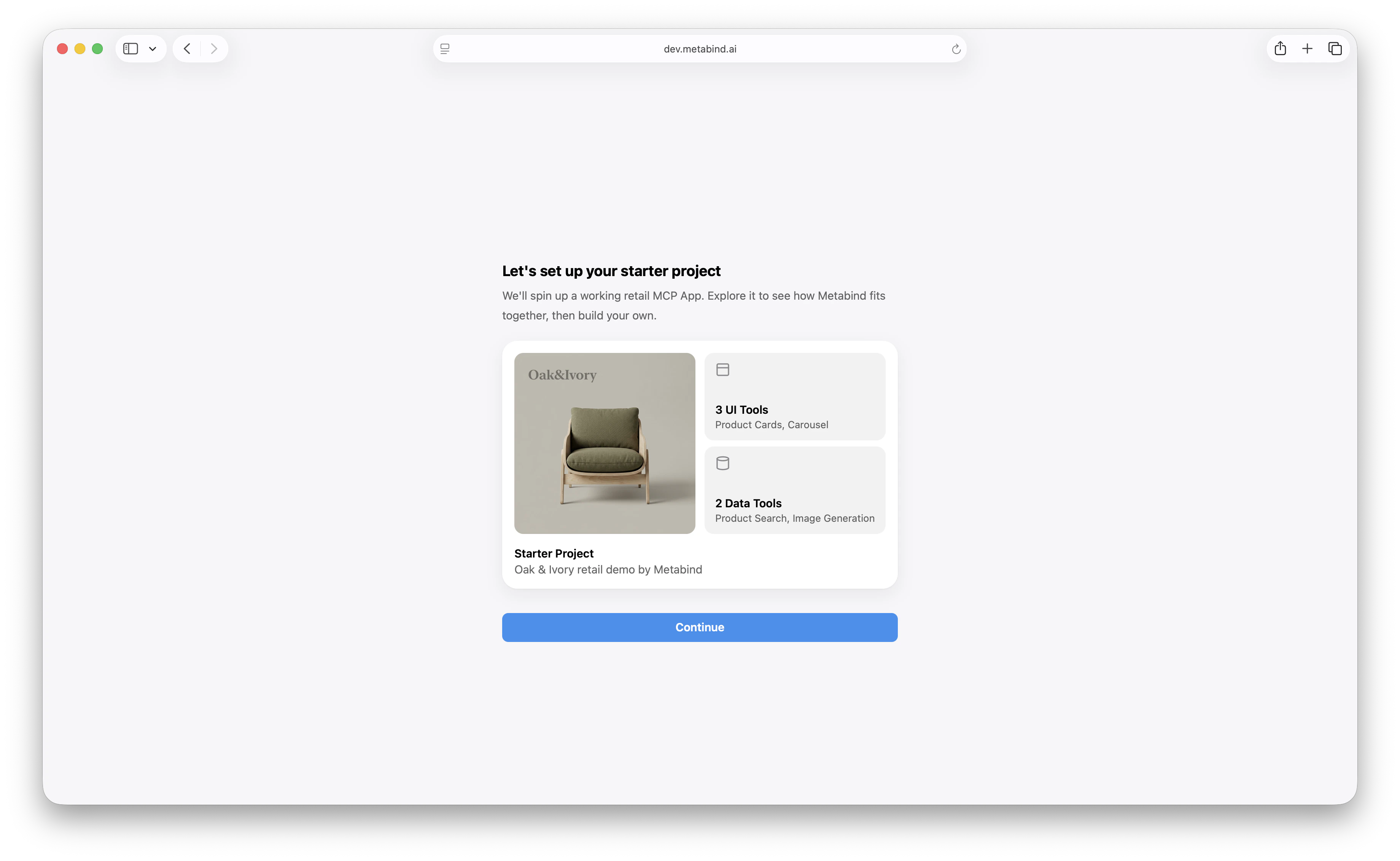
1. **In MCP App Studio onboarding.** When you create a new project, choose **Oak & Ivory** as the starter. MCP App Studio provisions the components, Types, and sample data.
2. **From a template.** In an existing organization, click **New project → Use template → Oak & Ivory**.
You get a fully working MCP App with no further setup. Open the project to see the components, test the tools, and connect a host.
The AI decides when to chain — `product_search` returns JSON, `product_detail` returns native UI.
## Get the sample
Two ways:
1. **In MCP App Studio onboarding.** When you create a new project, choose **Oak & Ivory** as the starter. MCP App Studio provisions the components, Types, and sample data.
2. **From a template.** In an existing organization, click **New project → Use template → Oak & Ivory**.
You get a fully working MCP App with no further setup. Open the project to see the components, test the tools, and connect a host.
 ## What's in the project
 The sample API runs on Metabind's infrastructure — no external dependencies to set up. For a production deployment, the `product_search` handler would point at your real catalog.
## How `product_search` works
The Data Tool's handler is intentionally simple — fetch a sample API, return the JSON:
```ts theme={null}
export default defineDataSource({
metadata: {
title: "Product Search",
description: "Search the Oak & Ivory catalog by keyword"
},
properties: {
query: { type: "string", description: "Search term" },
limit: { type: "number", validation: { min: 1, max: 25 }, defaultValue: 5 }
},
output: {
products: PropertyArray({ valueType: PropertyGroup({ ... }) }),
total: PropertyNumber({})
},
handler: async (props, env) => {
const url = `${env.apiBaseURL}/oak-ivory/search?q=${props.query}&limit=${props.limit}`;
const res = await fetch(url);
return res.json();
}
});
```
A real product would replace `env.apiBaseURL` with their own API base, add auth via `env.secrets`, and likely transform the response shape. The patterns are what generalize: schema validation, V8 sandbox, output validation, sandbox limits.
See [Sandboxed execution](/guides/building/sandboxed-execution) for the runtime model.
## How `product_detail` works
The Interactive Tool is bound to the `ProductCard` component. Its input schema mirrors the component's `properties`:
```ts theme={null}
properties: {
title: { type: "string" },
price: { type: "string" },
image: { type: "asset", assetTypes: ["image"] },
description: { type: "string", inspector: { control: "multiline" } },
reviews: {
type: "array",
valueType: PropertyGroup({
properties: {
author: PropertyString({}),
rating: PropertyNumber({ validation: { min: 1, max: 5 } }),
text: PropertyString({})
}
})
}
}
```
When the AI calls `product_detail` with a product, the platform:
1. Validates the input against the schema.
2. Compiles `ProductCard`'s BindJS layout against the input.
3. Returns an MCP UI resource the host renders natively.
On iOS, this becomes SwiftUI; on Android, Jetpack Compose; in a web host like ChatGPT or the Assistant SDK web build, React via `@bindjs/renderer`.
## Sub-component reuse
`ProductCard` is composed from smaller pieces — `ProductImage`, `ProductTitle`, `ShopButton`, `ReviewsSection`. These are normal BindJS components in the project, available as building blocks for other layouts.
If you add a `product_compare` tool that shows three products side-by-side, you could write a `ProductCompare` layout that reuses `ProductTitle` and `ProductImage`. The sub-components carry the styling, hover states, and accessibility through.
## Component allowlist
The project's allowed-components list includes the six components above. If a new MCP App reused this package and added a `LandingHero` layout, the project palette would need to grow to include it before the layout could reference it.
See [Component allowlists](/guides/building/allowed-components).
## Connecting Oak & Ivory to Claude Desktop
Once the sample is in your account:
1. Click **Connect** in the project sidebar.
2. Pick **Claude Desktop**.
3. Copy the config and paste it into your Claude Desktop config file. See [Connect to Claude Desktop](/guides/connecting-to-mcp-hosts/claude-desktop).
In Claude Desktop, ask:
```
Show me some running shoes from Oak and Ivory.
```
Claude calls `product_search`, picks the top result, then calls `product_detail` to render it. You see a native product card inline in the conversation.
## Embedding Oak & Ivory in your own app
To embed the same tools in a custom app via the Assistant SDK, see [Assistant SDK overview](/guides/getting-started/embed-an-assistant). Point the SDK at the Oak & Ivory project, configure your LLM provider, and ship. The same `product_search` and `product_detail` calls work, with the rendered cards showing up as native SwiftUI / Compose / React.
## Customizing Oak & Ivory
Once Oak & Ivory is in your account, it's a real project — modify it freely:
* **Replace the sample API.** Point `product_search` at your real catalog and add an API key secret.
* **Restyle the components.** Edit `ProductCard`, change colors, change layout.
* **Add new tools.** A `cart_add`, a `wishlist_save`, a `recommendations` Data Tool. Each becomes another Type.
* **Publish.** When you're done, publish the package — it's now your own MCP App.
Starting from the sample is the recommended path. The shape is correct; the content is yours to evolve.
## Related
The end-to-end tutorial that uses Oak & Ivory.
The pattern `product_detail` follows.
The pattern `product_search` follows.
Try Oak & Ivory's tools in a real host.
The sample API runs on Metabind's infrastructure — no external dependencies to set up. For a production deployment, the `product_search` handler would point at your real catalog.
## How `product_search` works
The Data Tool's handler is intentionally simple — fetch a sample API, return the JSON:
```ts theme={null}
export default defineDataSource({
metadata: {
title: "Product Search",
description: "Search the Oak & Ivory catalog by keyword"
},
properties: {
query: { type: "string", description: "Search term" },
limit: { type: "number", validation: { min: 1, max: 25 }, defaultValue: 5 }
},
output: {
products: PropertyArray({ valueType: PropertyGroup({ ... }) }),
total: PropertyNumber({})
},
handler: async (props, env) => {
const url = `${env.apiBaseURL}/oak-ivory/search?q=${props.query}&limit=${props.limit}`;
const res = await fetch(url);
return res.json();
}
});
```
A real product would replace `env.apiBaseURL` with their own API base, add auth via `env.secrets`, and likely transform the response shape. The patterns are what generalize: schema validation, V8 sandbox, output validation, sandbox limits.
See [Sandboxed execution](/guides/building/sandboxed-execution) for the runtime model.
## How `product_detail` works
The Interactive Tool is bound to the `ProductCard` component. Its input schema mirrors the component's `properties`:
```ts theme={null}
properties: {
title: { type: "string" },
price: { type: "string" },
image: { type: "asset", assetTypes: ["image"] },
description: { type: "string", inspector: { control: "multiline" } },
reviews: {
type: "array",
valueType: PropertyGroup({
properties: {
author: PropertyString({}),
rating: PropertyNumber({ validation: { min: 1, max: 5 } }),
text: PropertyString({})
}
})
}
}
```
When the AI calls `product_detail` with a product, the platform:
1. Validates the input against the schema.
2. Compiles `ProductCard`'s BindJS layout against the input.
3. Returns an MCP UI resource the host renders natively.
On iOS, this becomes SwiftUI; on Android, Jetpack Compose; in a web host like ChatGPT or the Assistant SDK web build, React via `@bindjs/renderer`.
## Sub-component reuse
`ProductCard` is composed from smaller pieces — `ProductImage`, `ProductTitle`, `ShopButton`, `ReviewsSection`. These are normal BindJS components in the project, available as building blocks for other layouts.
If you add a `product_compare` tool that shows three products side-by-side, you could write a `ProductCompare` layout that reuses `ProductTitle` and `ProductImage`. The sub-components carry the styling, hover states, and accessibility through.
## Component allowlist
The project's allowed-components list includes the six components above. If a new MCP App reused this package and added a `LandingHero` layout, the project palette would need to grow to include it before the layout could reference it.
See [Component allowlists](/guides/building/allowed-components).
## Connecting Oak & Ivory to Claude Desktop
Once the sample is in your account:
1. Click **Connect** in the project sidebar.
2. Pick **Claude Desktop**.
3. Copy the config and paste it into your Claude Desktop config file. See [Connect to Claude Desktop](/guides/connecting-to-mcp-hosts/claude-desktop).
In Claude Desktop, ask:
```
Show me some running shoes from Oak and Ivory.
```
Claude calls `product_search`, picks the top result, then calls `product_detail` to render it. You see a native product card inline in the conversation.
## Embedding Oak & Ivory in your own app
To embed the same tools in a custom app via the Assistant SDK, see [Assistant SDK overview](/guides/getting-started/embed-an-assistant). Point the SDK at the Oak & Ivory project, configure your LLM provider, and ship. The same `product_search` and `product_detail` calls work, with the rendered cards showing up as native SwiftUI / Compose / React.
## Customizing Oak & Ivory
Once Oak & Ivory is in your account, it's a real project — modify it freely:
* **Replace the sample API.** Point `product_search` at your real catalog and add an API key secret.
* **Restyle the components.** Edit `ProductCard`, change colors, change layout.
* **Add new tools.** A `cart_add`, a `wishlist_save`, a `recommendations` Data Tool. Each becomes another Type.
* **Publish.** When you're done, publish the package — it's now your own MCP App.
Starting from the sample is the recommended path. The shape is correct; the content is yours to evolve.
## Related
The end-to-end tutorial that uses Oak & Ivory.
The pattern `product_detail` follows.
The pattern `product_search` follows.
Try Oak & Ivory's tools in a real host.