

Prerequisites
- Familiarity with Components and Packages.
- Basic understanding of declarative UI (SwiftUI or similar). BindJS is inspired by SwiftUI’s API.
The components surface in MCP App Studio
The Components tab in MCP App Studio is the BindJS authoring surface. The left sidebar lists every component in the project’s package; the center pane is a code editor; the right pane is the live preview.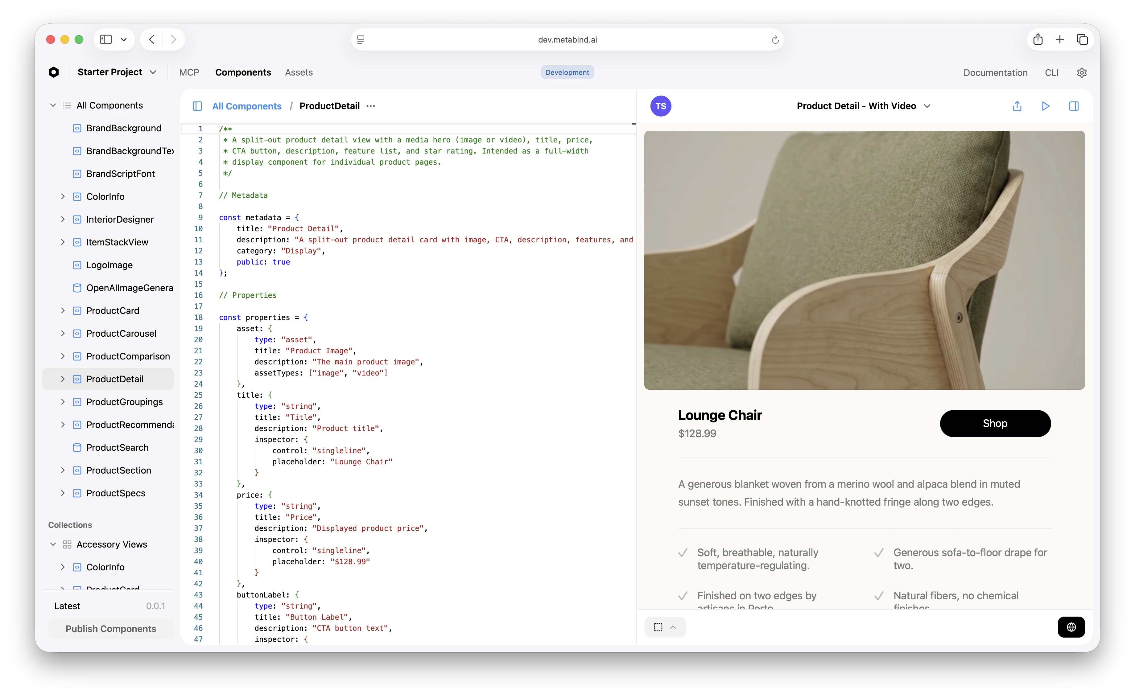
Component file structure
A typical component file has these sections:properties, body, and the default export — but following the convention helps anyone (including yourself in three months) read the file.
The property system
A component’sproperties block declares two things at once: the tool’s input schema (what the AI must provide) and the inspector configuration (how a non-developer configures the property in MCP App Studio).
| Property type | Use for |
|---|---|
string | Text values |
number | Numeric values, optionally with min/max/step |
boolean | Toggles |
asset | Images, videos, 3D models, PDFs (with assetTypes) |
array | Lists of values, with valueType for each item |
group | Nested object with its own properties |
component | A reference to another component (with allowedComponents) |
inspector config controls the editor UI:
Layout primitives
BindJS layout primitives follow a SwiftUI-inspired shape:VStack({ spacing, alignment }, [children])— vertical stack.HStack({ spacing, alignment }, [children])— horizontal stack.ZStack([children])— overlapping layers.Spacer()— flexible space.ScrollView([children])— scrollable container.
Sub-components and reuse
Break a complexbody into named functions:
Custom button styles and modifiers
Button styles usedefineButtonStyle():
Iterating with the live preview
The preview re-renders on save. A few tips for fast iteration:- Add multiple
previewsentries for different states — empty, populated, error. Switch between them in the preview pane. - Edit the preview file directly to test edge cases without touching the test panel inputs.
- Use the live device preview (App Clip on iOS, Android preview, web link) to test how the component renders on actual hardware before publishing. See Live device previews.
Common patterns
A few things you’ll write often:- Conditional rendering: Use
props.x ? Component(...) : Empty(). - Asset fallbacks: Test for video before image:
props.asset?.video ? Video(...) : Image(...). - Looping:
props.items.map((item) => ItemView(item))inside a stack. - Spacing: Prefer
spacingon stacks rather thanSpacerbetween children. - Hover/tap state: Use
useStateandonHover/onTapGesturemodifiers.
Related
Components and Packages
Conceptual: shapes, packaging, versioning.
Live device previews
Preview on real iOS/Android devices.
BindJS Reference
Full BindJS API.
Component allowlists
Restrict what the AI can compose.