

Prerequisites
- A project with
type: "mcp". See Project setup. - Familiarity with Tools and Types and Components and Packages.
1. Author a layout component
A layout component is the BindJS code that:- Declares the tool’s input schema (via
properties). - Defines what the AI is allowed to render (via component allowlists).
- Renders the validated input as a layout.
Add a previews array
Previews are sample inputs that MCP App Studio uses to render the component without an AI call. Always include at least one — it’s how you’ll test changes.
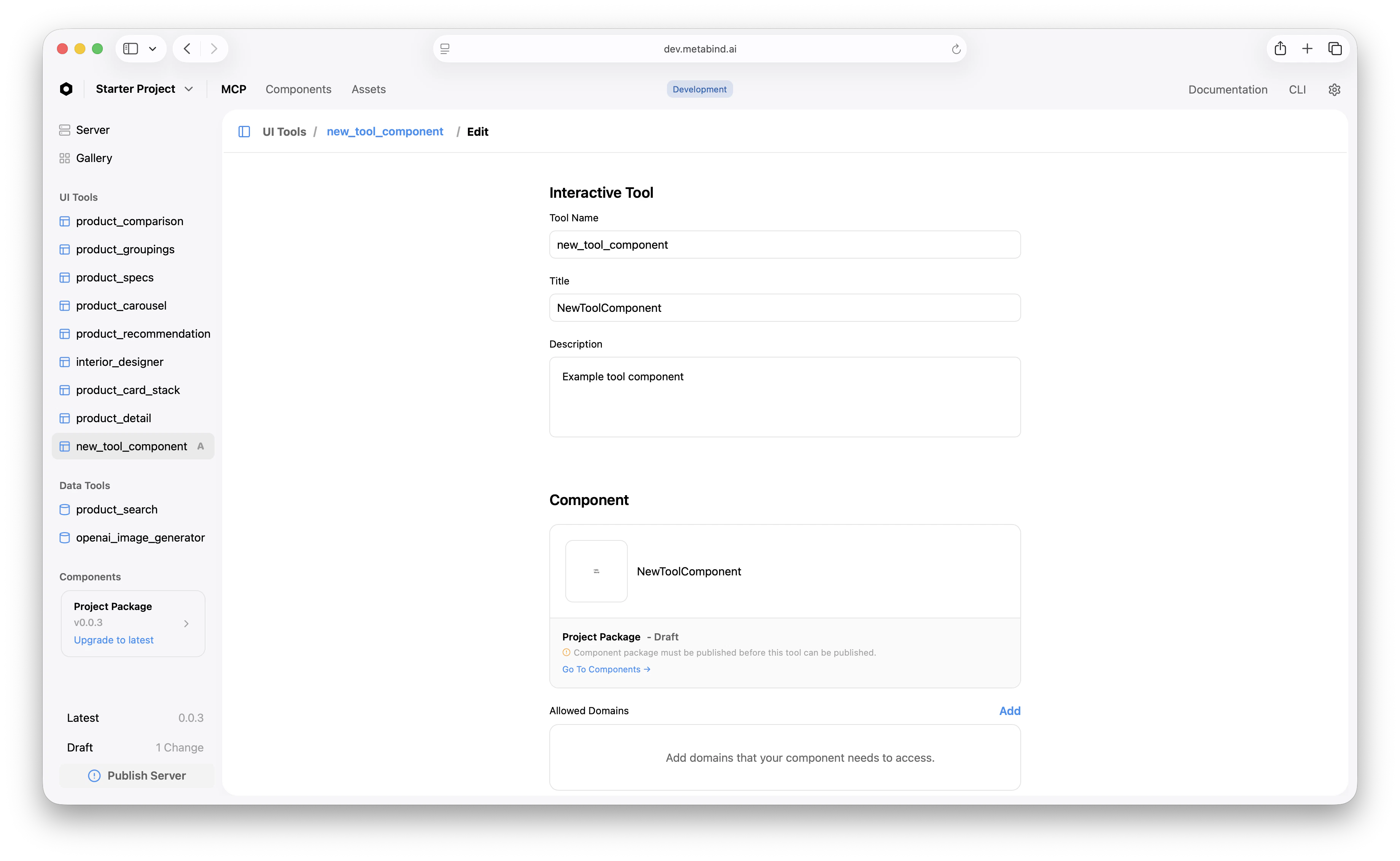
2. Create a Type that points at the component
A Type registers the component with the MCP server. In MCP App Studio:- Open UI Tools in the project sidebar and click + to add one.
- Select the layout component you just authored.
- Set the Type’s name (becomes the slug, the MCP tool name) and description (becomes the LLM-facing tool description).
- Save.
properties. The Type’s name slugifies to lowercase-underscore — Product Detail → product_detail. The slug is immutable after first publish.
3. Configure allowed components (for layouts that compose children)
If your layout accepts children — for example, a layout that renders a list of arbitrary product cards — declare the allowed children on the property:components. Any other reference is rejected during schema validation. See Component allowlists.
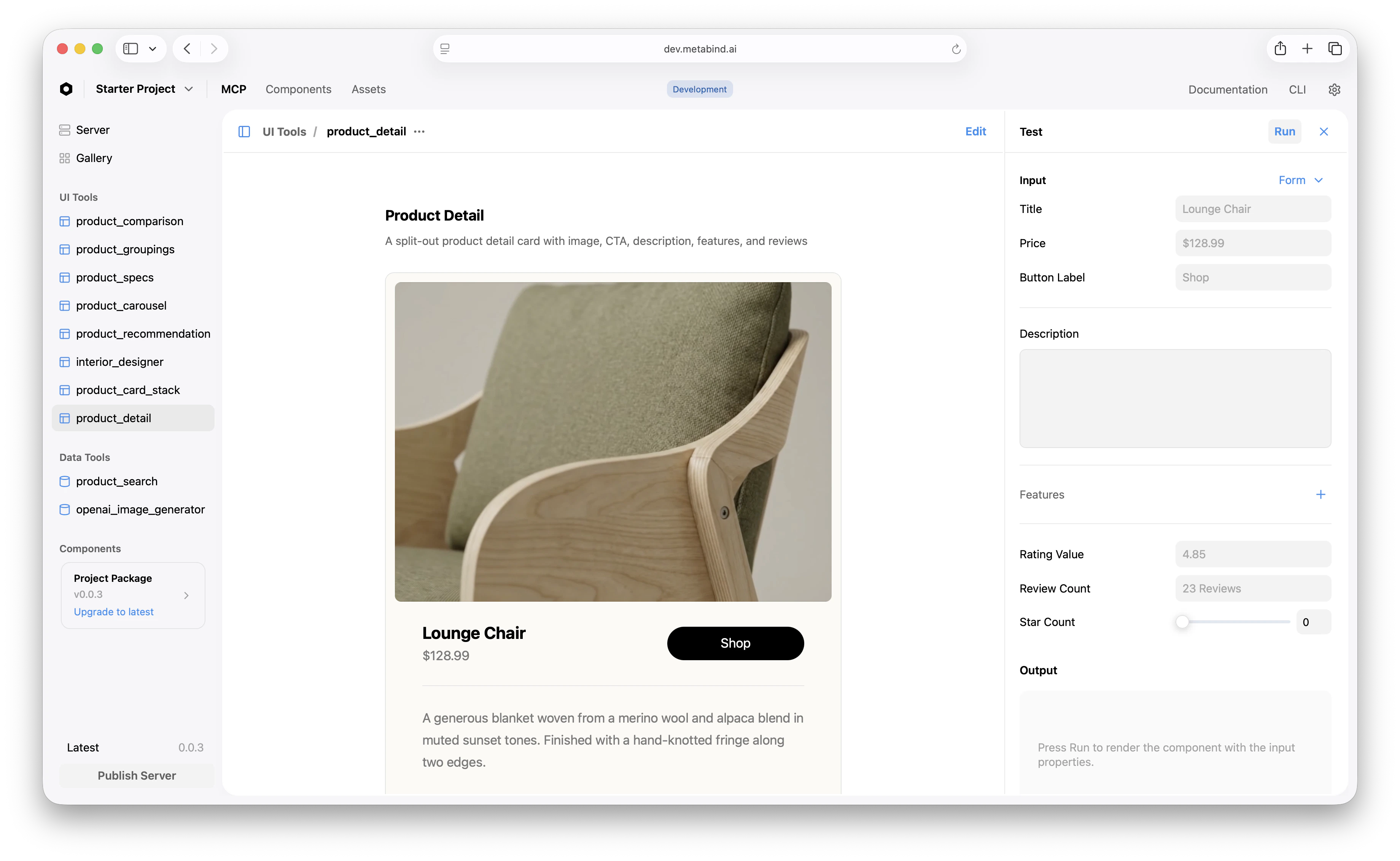
4. Test the tool inline
In MCP App Studio, click the Type. The center pane shows a live preview; the right pane is the test panel.- Fill the test inputs (or use the defaults from your
previewsarray). - Click Run.
- The platform validates your input against the schema, compiles BindJS, resolves the package, and renders the result.
5. Iterate and refine
A few common refinements once the basic tool works:- Tighten the description. The Type’s description is the tool’s MCP description — what the AI reads when deciding whether to call it. Make it specific: “Render a single product detail card. Use when the user wants to view one product in depth, not when comparing multiple products.”
- Add validation to properties.
minLength,maxLength,min,max,pattern. Schema violations return clear errors to the AI on retry. - Constrain allowed components tightly. The smaller the allowlist, the more predictable the AI’s output.
- Update the project Instructions to reference the new tool and describe when it should be used. See Project setup.
6. Publish
Once the tool works on the draft endpoint, publish the server to promote it to production.Related
Authoring BindJS components
Component primitives, modifiers, and the inspector schema.
Component allowlists
Constrain what the AI can render.
Testing tools in MCP App Studio
The test panel, preview gallery, and live device preview.
Tools and Types
Conceptual: how Types become MCP tools.