

Where allowlists live: on the slot property
A layout component’sarray or component properties declare what’s allowed inside them via the allowedComponents field:
ProductCard, the platform checks: is ProductCard on this slot’s allowlist? If yes, render. Otherwise reject before rendering.
Layouts can nest
A layout component required as the root of an Interactive Tool can include child components that are themselves layouts with their ownallowedComponents slots. Nesting works without changing the model — each slot is checked against its own allowlist.
The full JSON schema the LLM sees describes the root layout, every slot it exposes, and every nested layout’s slots in turn — so the AI knows exactly what’s composable in each position.
Component groups
If a layout has multiple content areas — a main body and a sidebar, a header and a footer — declare separate properties with their own allowlists:Enforcement
Allowlist enforcement happens at the same point as schema validation — before the renderer sees anything:
Designing good allowlists
A few principles:- Keep allowlists tight. The smaller the list, the more predictable the AI’s output. A layout that allows 4 components produces more consistent UI than one that allows 40.
- Group by intent, not by visual category. Allow
ProductCardandProductCarouselin a slot meant for product browsing. Don’t allowChartthere even if charts could fit visually — they don’t fit semantically. - Document the allowlist’s purpose in the slot’s
descriptionso the AI understands what to use the slot for. The AI’s planner reads descriptions, not just the component names. - Version allowlists with the package. A new package version can expand or contract a slot’s allowlist; published Types pinned to older package versions keep the older list.
Where allowlists are configured in MCP App Studio
Allowlists are part of the layout component’s BindJS source. Edit them in the Components tab → component file → property definition: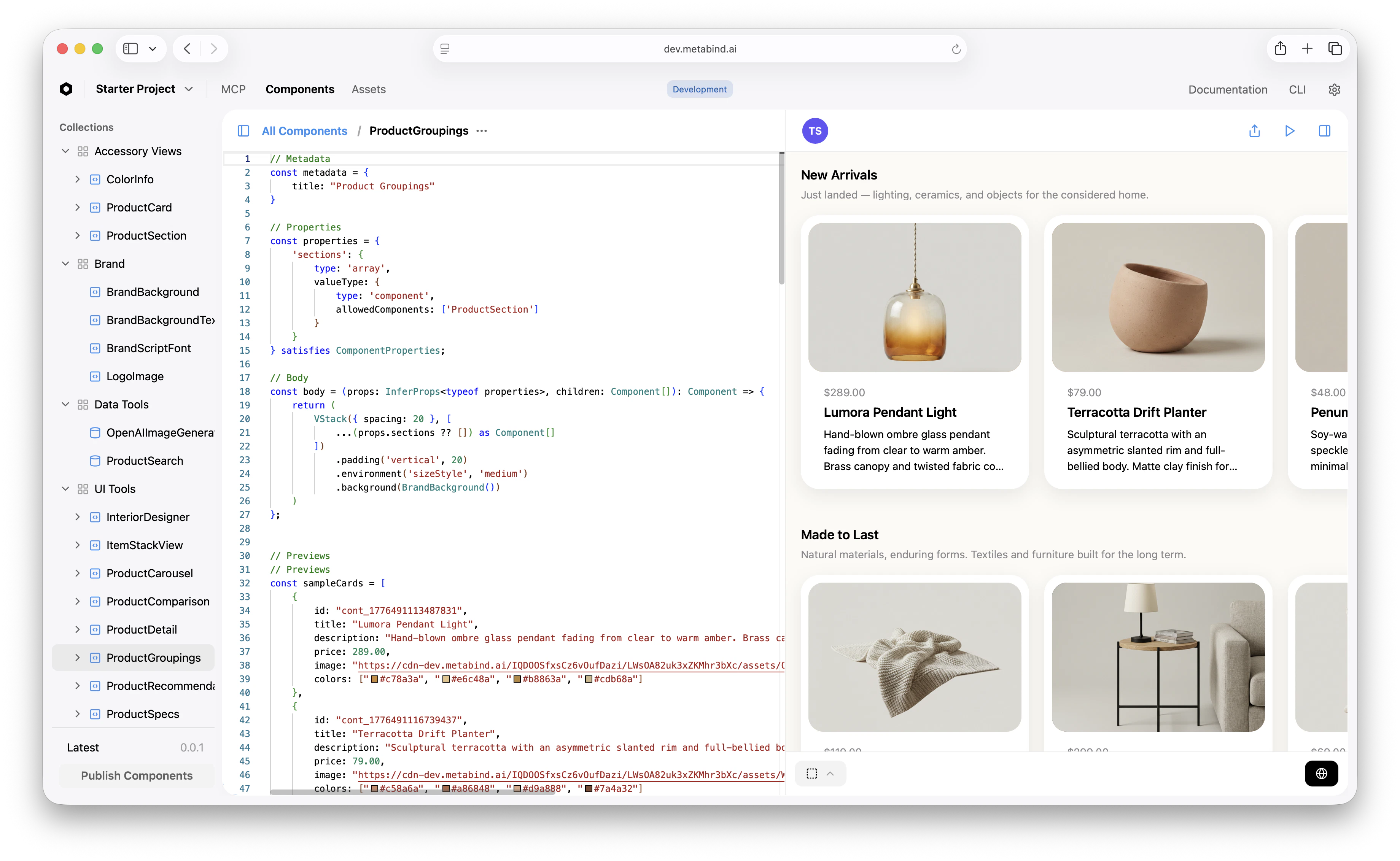
What allowlists do not constrain
- Property values. Allowlists scope which components can appear, not what data they receive. Property-level validation (
pattern,min,max,enum) handles data constraints. - Number of components. Use
minItemsandmaxItemsfor that. - Component ordering. The AI chooses the order. If order matters (a header must come before a body), enforce that with separate properties rather than a single ordered array.
Related
Build an Interactive Tool
The walkthrough that uses allowlists in context.
Governance
Conceptual: where allowlists fit alongside schema validation and audit.
Schema validation
The other server-side gate that runs before rendering.
BindJS Reference
Property types, the
component and array shapes.