

inspector block to its definition. This page is the reference for every supported control and option.
Where the inspector lives
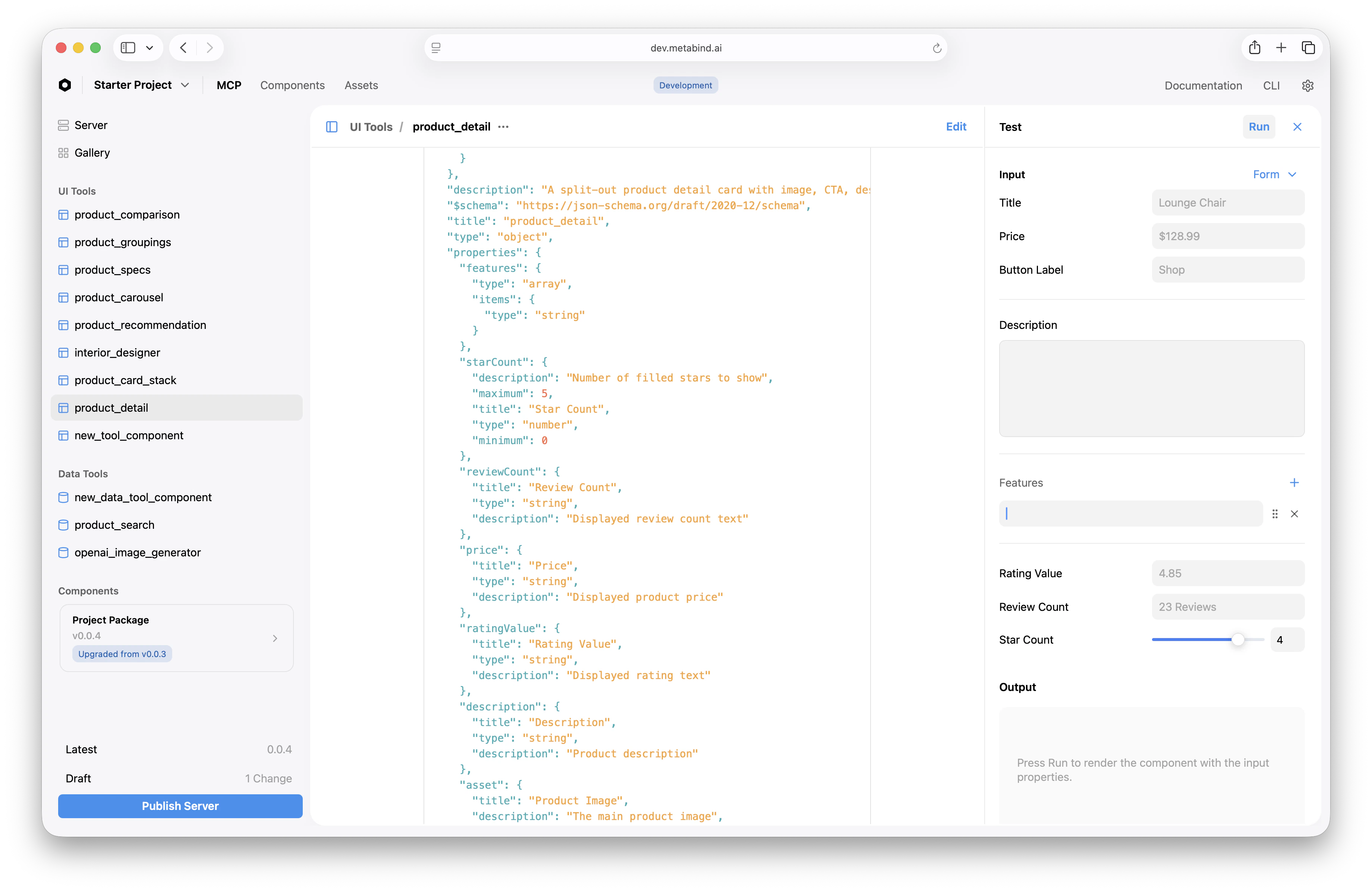
When a component is bound to a Type, the Type’s edit page shows an inspector form generated from the component’sproperties. Editors fill the form; the values flow through to the rendered component on save.
Common options (all property types)
These options apply to every property’sinspector block, regardless of type:
| Option | Type | Purpose |
|---|---|---|
showLabel | boolean | Show or hide the field label in the inspector. Default true. |
showDivider | boolean | Show a divider line above this field — useful for grouping. |
helpDescription | string | One-line help text shown beneath the field. |
visible | (props) => boolean | Conditionally show the field based on the values of other fields. |
control values by property type
The control option determines the inspector UI. Valid values depend on the property’s type.
string properties
control | UI |
|---|---|
singleline | Single-line text input. Default for string. |
multiline | Multi-line text area. |
code | Monospace code editor with syntax highlighting. |
| Option | Type | Purpose |
|---|---|---|
placeholder | string | Placeholder text shown when empty. |
markdown | boolean | Enable a formatting toolbar (multiline only). |
numberOfLines | number | Initial height in lines for multiline. |
number and integer properties
control | UI |
|---|---|
slider | Slider with min/max from validation. |
input | Numeric input field. Default. |
| Option | Type | Purpose |
|---|---|---|
step | number | Increment for slider or stepper. |
enum properties
control | UI |
|---|---|
segmented | Segmented control (good for ≤ 4 options). |
dropdown | Standard dropdown. Default. |
boolean properties
Booleans render as a toggle switch automatically — no explicit control value is needed. Use inspector to add a helpDescription or to gate visibility.
date properties
Dates render as a date picker. There is no control option — instead, use placeholder or other top-level inspector options.
asset properties
Asset properties render as an asset picker that opens the project’s asset library. The picker filters by the property’s assetTypes (e.g., ["image"], ["video"], ["model"]).
array properties
Arrays render as a repeatable group with + Add and − controls. Each item uses the valueType’s inspector configuration. For arrays of components (valueType: { type: "component" }), the picker filters by allowedComponents.
component properties
Component properties render as a typed picker showing only the components on the slot’s allowedComponents list. Picking one inserts the component reference; double-clicking opens its inspector.
group properties
Groups render as nested forms inside a collapsible section. Each nested property uses its own inspector configuration.
Conditional visibility (visible)
The visible callback runs every time the component’s values change. Use it to hide fields that don’t apply to the current state:
Layout grouping
UseshowDivider: true on the first property of a logical group to visually separate it from the previous group. There is no explicit “group” wrapper — dividers do the work.
For nested groups (a property whose type is group), the inspector renders the nested fields in a collapsible section.
Validation
inspector configures appearance and editor UX, not constraints. Constraints live under the property’s separate validation block:
validation before any tool call resolves, regardless of what the inspector showed the editor.
Related
MCP App Studio
The visual development surface the inspector lives in.
Authoring BindJS components
Where you write the property definitions the inspector renders.
BindJS Reference
Property type reference:
string, number, enum, array, group, etc.Schema validation
How
validation constraints are enforced on every tool call.